Fall 2025 | Skill Development
Collaboration, Ergonomic and Tactile User Testing, Manufacturing Exploration, Packaging, Branding, Marketing
Bring back ease to your morning and clarity to your life, with Wink Daily Contacts, designed specific to each individual user.
Wink Daily Contacts
According to the Centers for Disease Control and Prevention (CDC), an estimated 45 million Americans wear contact lenses, with nearly 90% of new wearers choosing daily disposables for the easy convenience. This comes at a cost up to five times higher than monthly prescriptions, yet 1 in 3 users struggle with handling, including opening packages to distinguishing lenses in dim lighting / without their corrective glasses on. Current packaging often tears inconsistently, leaves contacts loose, and lacks any sort of powerful premium branding.
Is there a way we can design a new system for daily disposable lenses that delivers on its premium promise and is equipped with tactile or visual markers to help these on the go users insert lenses with confidence?
Opportunity Space
Market & Product
Daily contacts are classified as Class II medical devices by the FDA, falling into the vision care and optical health industry rather than in general retail.
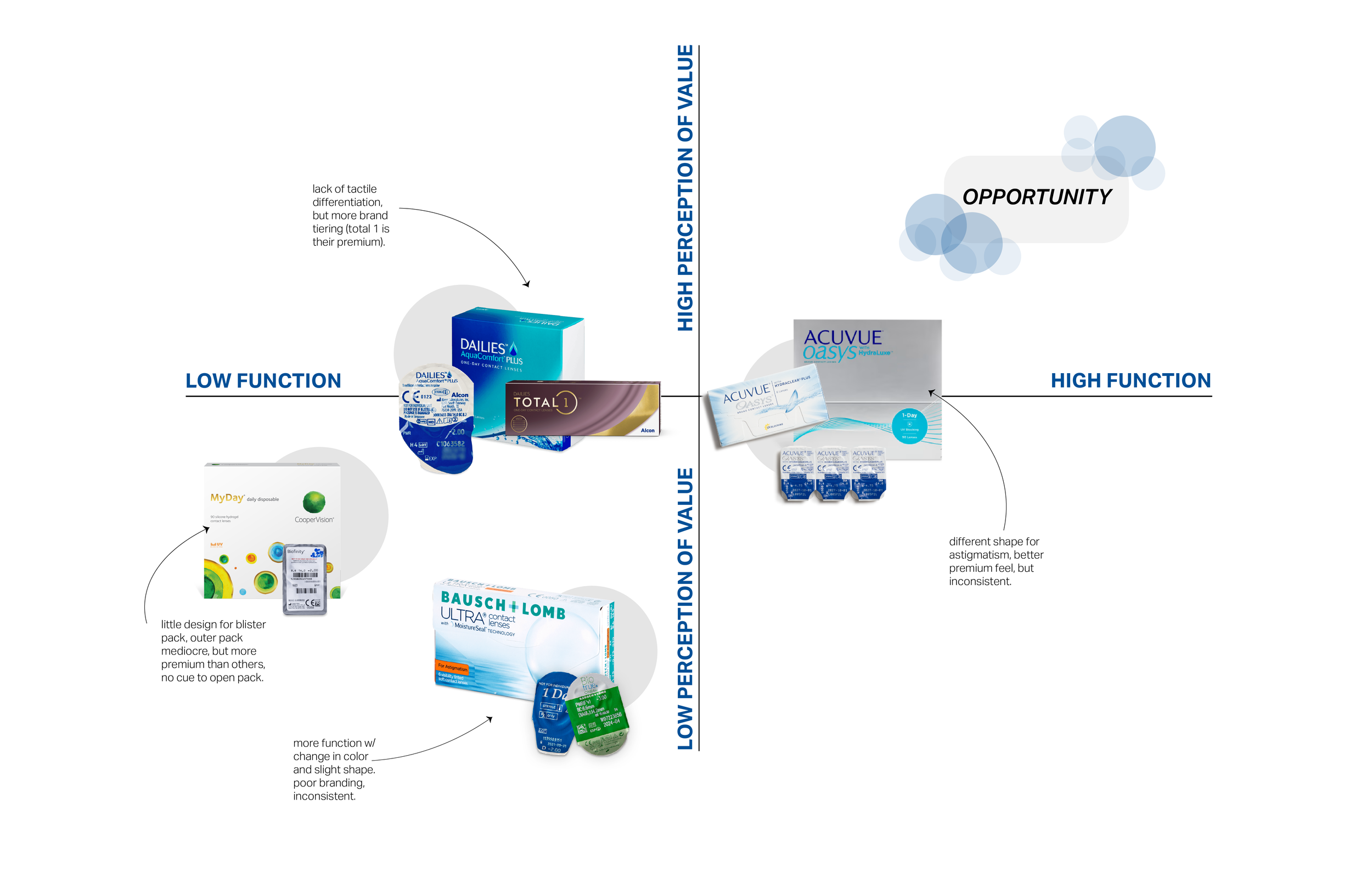
Competitor Matrix
Strong Branding meets Functional Pack (top right)
Durable, organized box (clean open, travel-friendly).
Blister packs with tactile/textured differentiation (left/right cues, orientation hints).
Premium experience that finally aligns with premium pricing.
Potential Differentiators
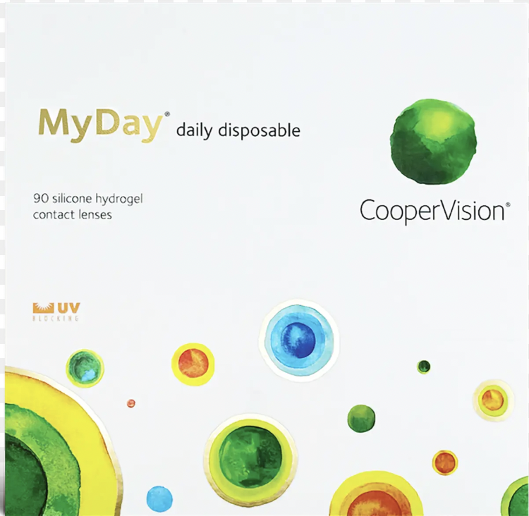
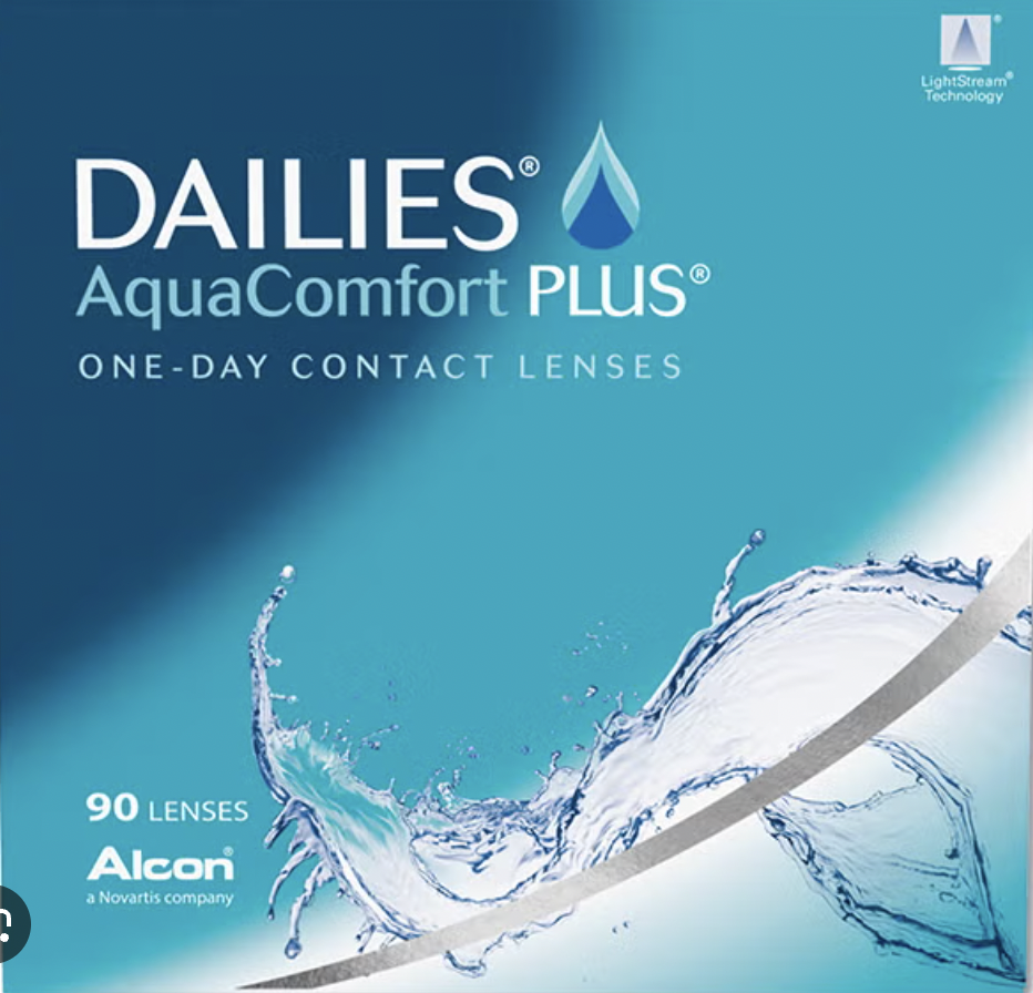
PLAYFUL & PREMIUM
STYLISH | TRENDY | OPTIMISTIC
Younger audience focused
Comfort focused products
Affordable, yet premium products
PLAYFUL & CONVENIENT
LIGHT-HEARTED | BUBBLY | INSTANT
Efficiency-oriented service, utilizing delivery
On-the-go consumer product
Playful and trendy brand experience
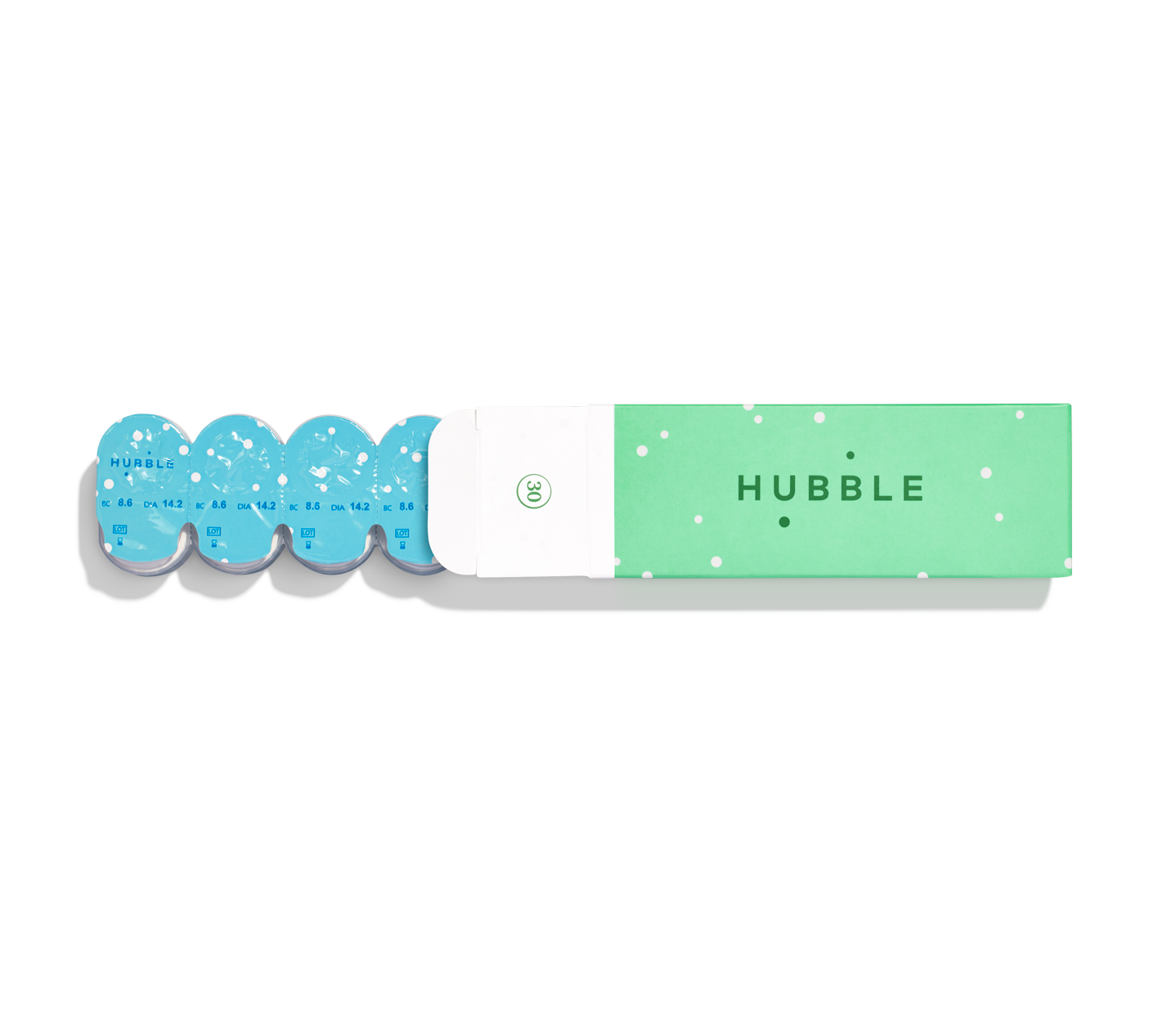
Consumer Target
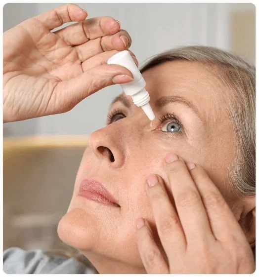
The Daily Lens User:
Professionals, travelers, students, parents — people with fast-paced lifestyles. Consumers who prioritize convenience & flexibility. They are willing to pay a premium for daily lenses because they see value in the simplicity (no cleaning, no storage).
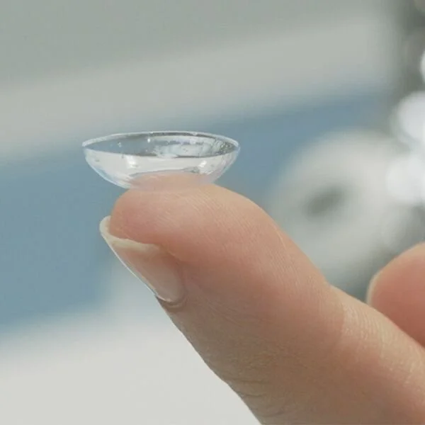
The Consumer Desire:
Want to spend minimal time and effort, expect packaging to be intuitive. Frustrated by anything stalling, tend to tear open boxes. They prioritize convenience — often inserting lenses in different conditions like the car, bathroom, low light, and without glasses.
Analyzing the Task
Step 1 | Open Pack

Pain Points
No graphic navigation to open boxBox often torn openDifficult to reach contacts
Cognitive | Pain Point
Foil can be difficult to peel causing spillage
Problems to Solve
Stability, dropping contacts, inserting w/out lighting or mirror
Users stressed under time pressure.Visual | Pain Point
Step 2 | Peel Foil
Difficult to determine L/RBalancing lens & blister pack simultaneously
Visual impairment during handling.Pack waste is high, non-recyclable
Reduced patience for tricky packaging, needs easy steps with minimal effort.
Desire for bold, high contrast cues (visual + tactile) differentiation.
Location | Pain Point
Stored outside controlled environment (bathroom, on the go, dark bedroom).Need for durability & portability while remaining sterile.
Dexterity | Pain Point
Lens primary pack are slippery, tiny, and delicate.Step 3 | Handle Lens
Step 4 | Application
Step 5 | Disposal
Desire for easy-to-grip edges, tactile markers for L/R recognition.
Brand Solution

Playful | Premium | Convenient
A thoughtfully designed premium service, innovating the contact wearing experience by prioritizing consumer personalization, comfort, & ease of use, allowing users to feel confident and in control of their routine.
The affordable luxury, every daily contact user needs in their routine.
Name is friendly and inviting compared to competitors.
Inspired by the Physical Eye, instantly recognizable brand focus.
Name is efficient and simple, as are our daily contacts.
Initial Ideation | Primary Pack
Lens Exploratory & Prototyping
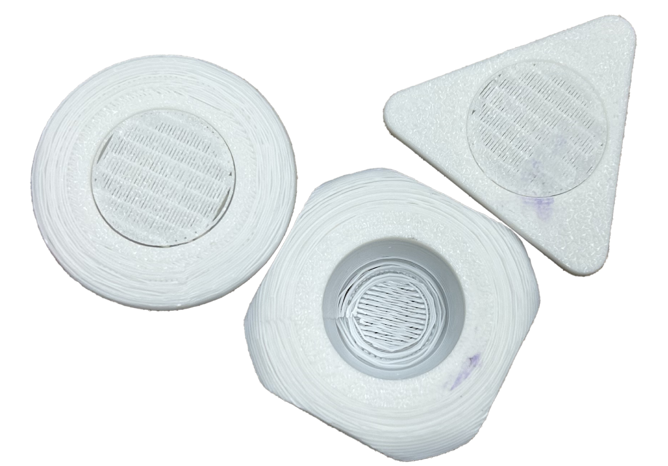
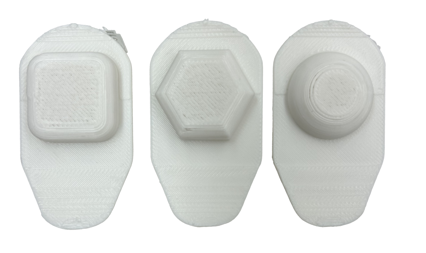
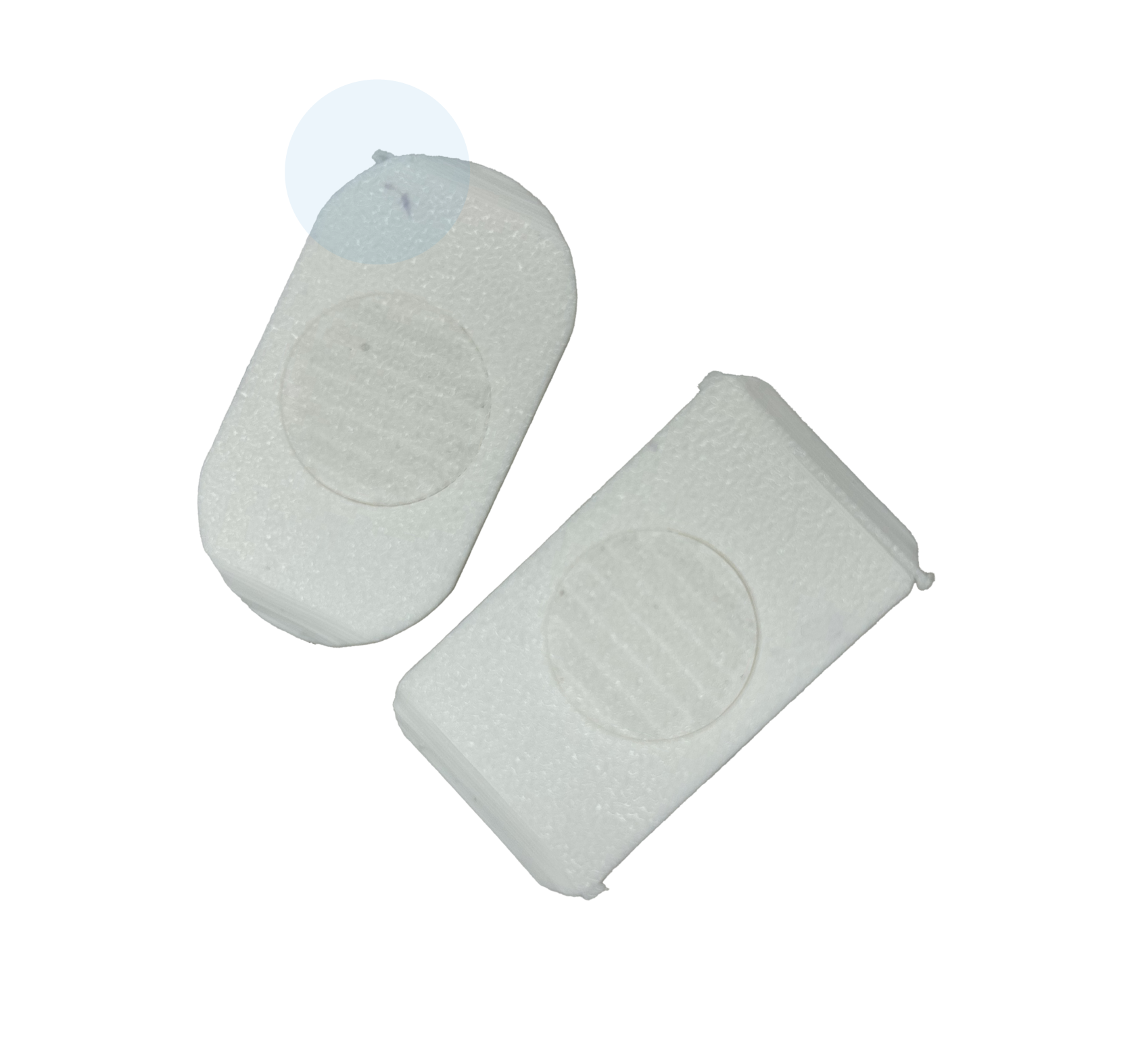

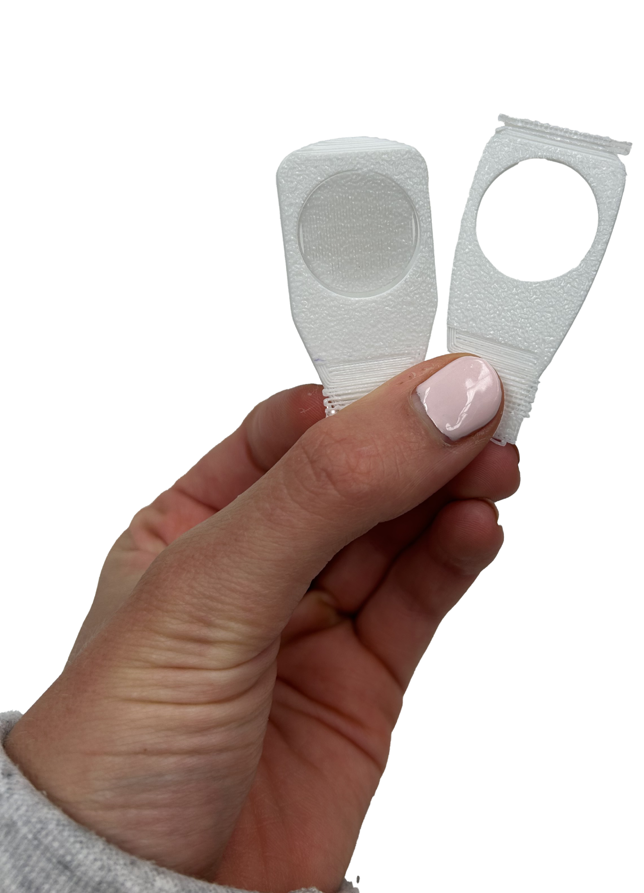
What Can Actually be Manufactured?
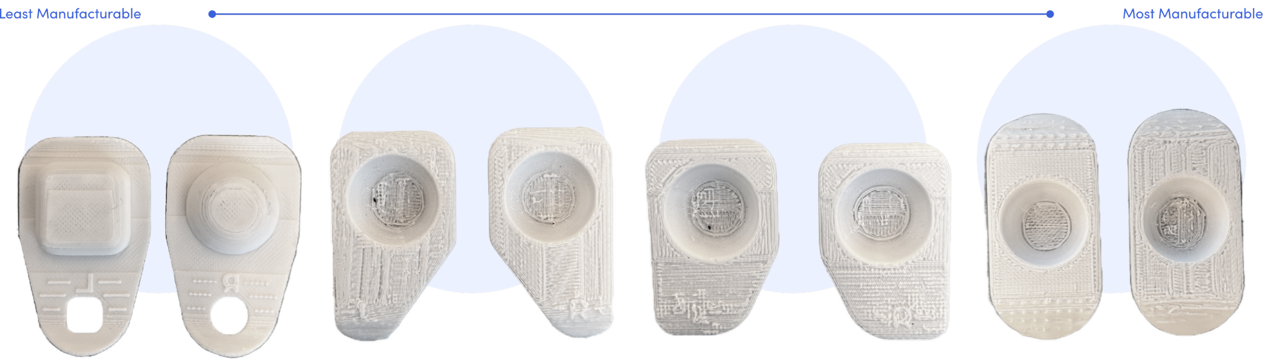
Shape Texture
Sharp Angle
Subtle Angle
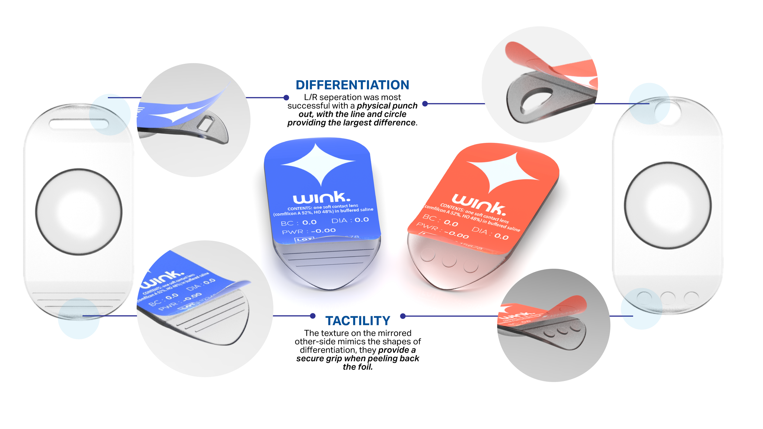
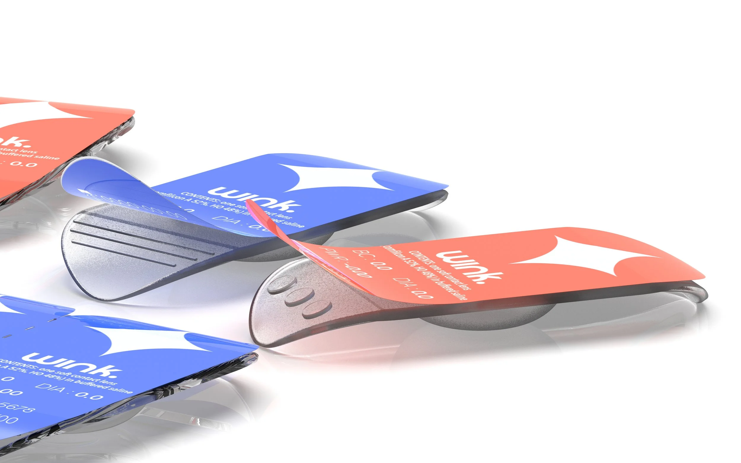
Little tooling risk as very close to current blister shapes the emboss is easy to integrate, differentiation is still distinct, but less area to grip on foil peeling.
Symmetrical Oval
Square cavity is highest risk as it
can trap air bubbles & create a weak seal. Ability to explore cutouts and texture pattern for its strong distinction.
Non rectilinear outlines complicate web layout & die-cutting creating material waste. However, strong human factor cue for visual & tactile distinction
Easy thermoform & seal as oval is friendly to tooling however minimal L/R differentiation without letters, but best usability enhancement on the grip.
Deciding to move forward with the oval as it was most functionally beneficial and manufacturable, creating a third round of prototypes define our final direction.

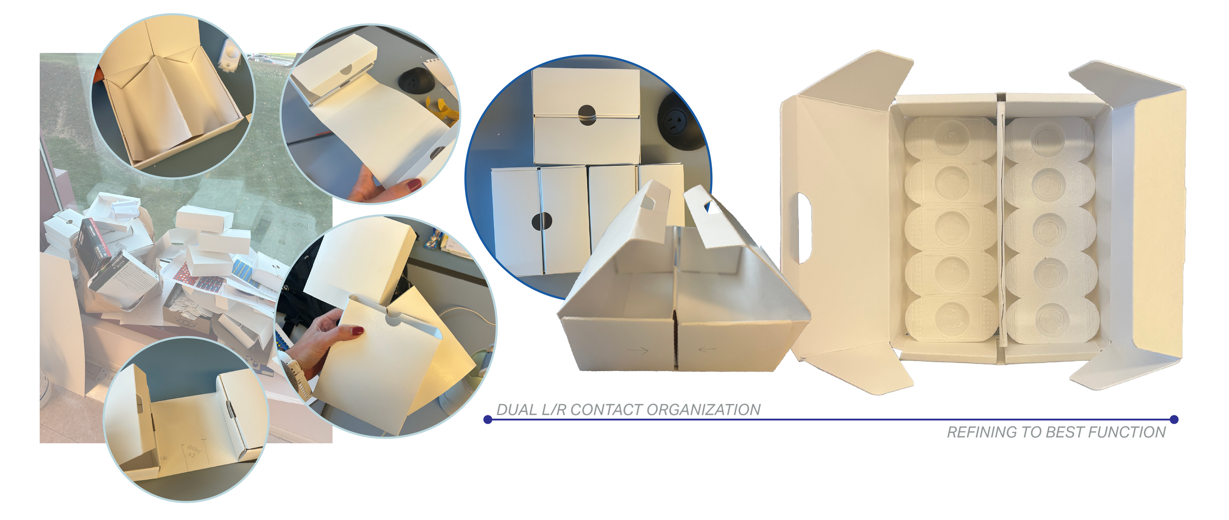
Narrowing the Secondary Pack.
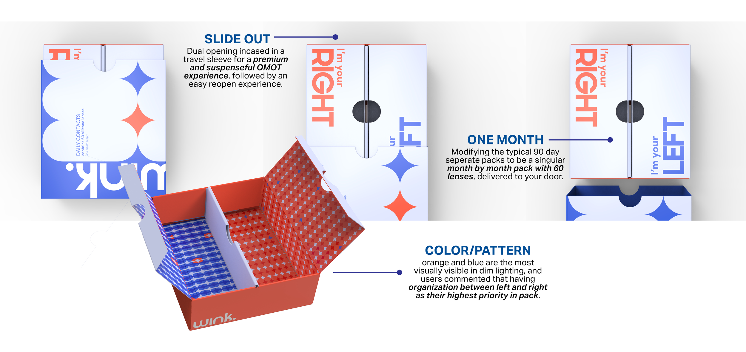
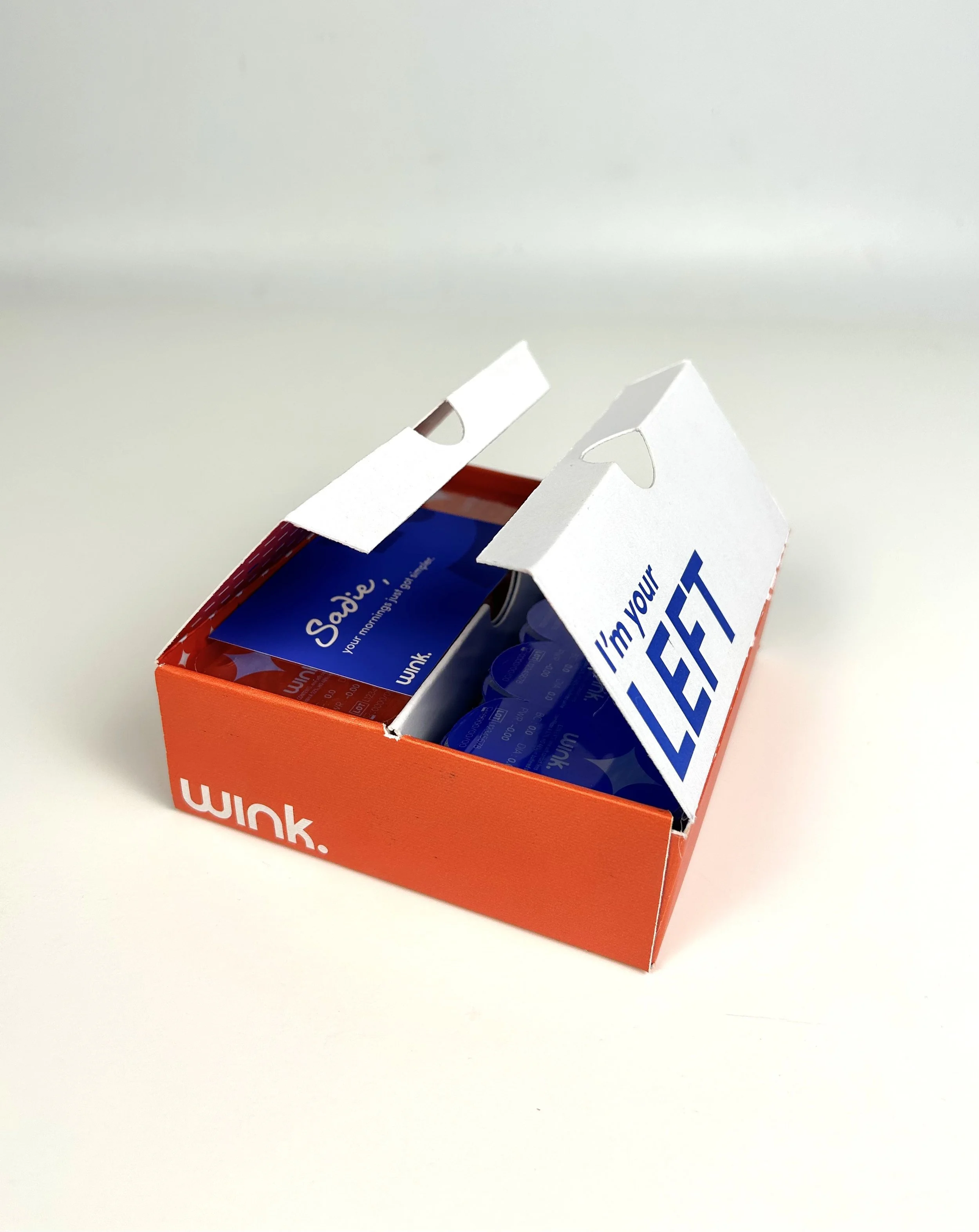
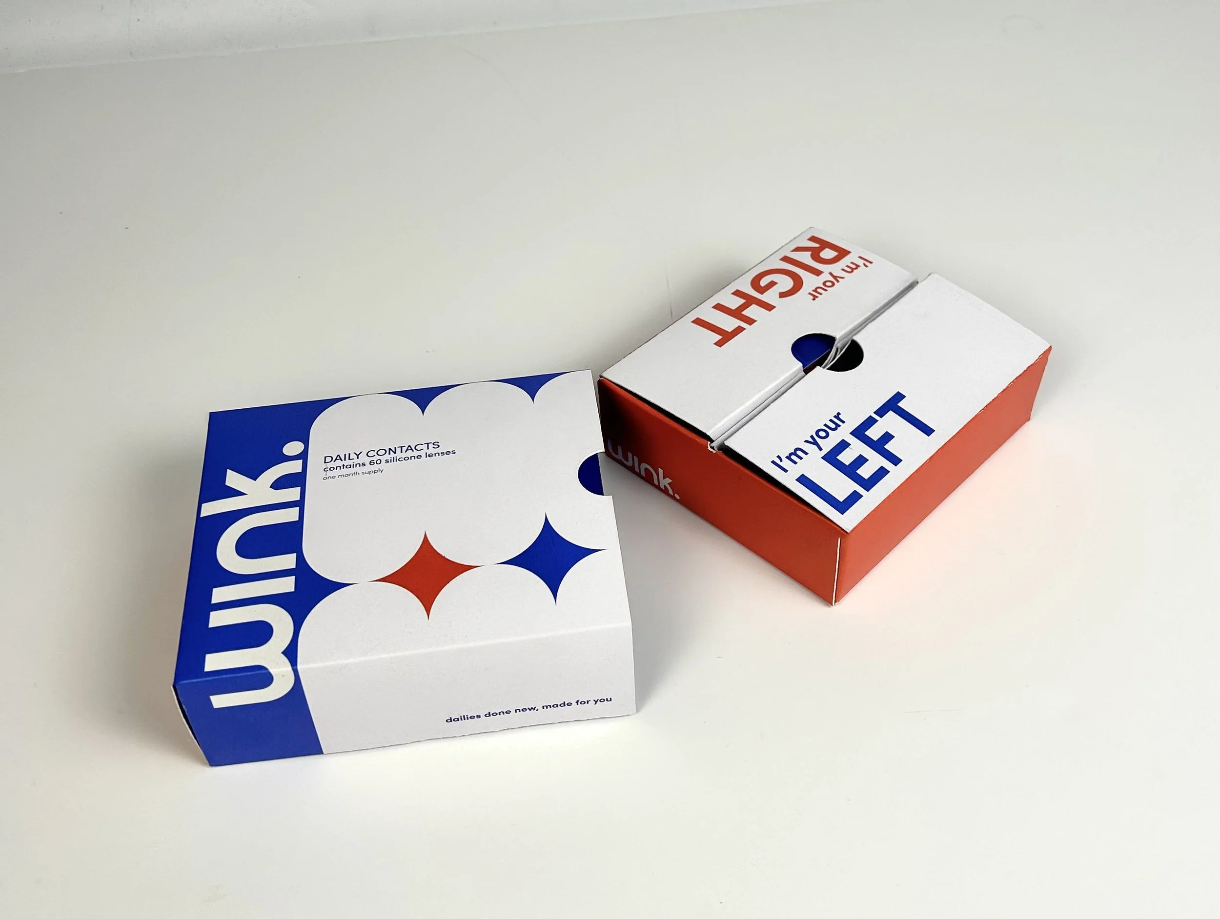
Refining the original secondary package concepts to reflect the final primary blister pack form, focusing on L/R organization as our primary JTBD. .

Developing the Final Structure.
Honing in on our desired final design, focusing on the book opening, refining down to the best functional iterations with user and peer feedback.
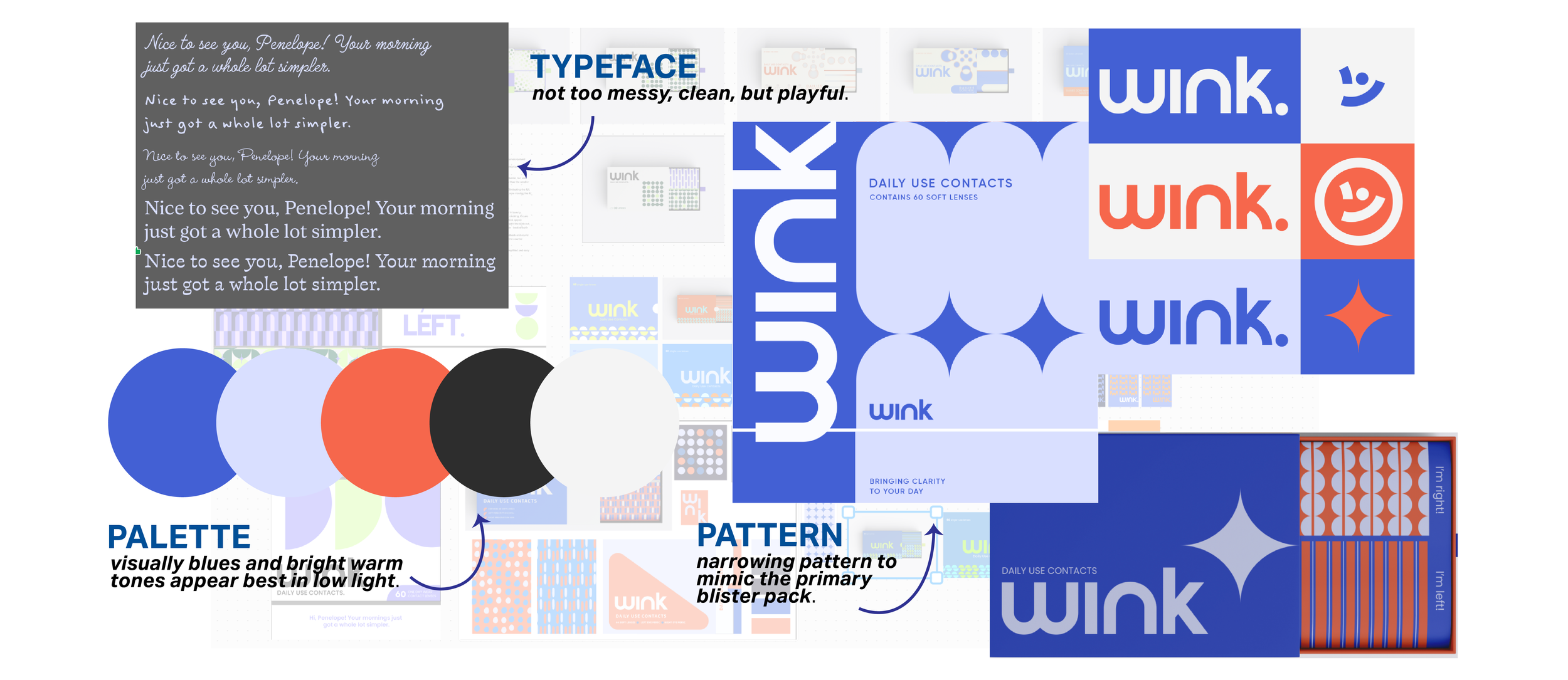
Developing the Pack Branding.
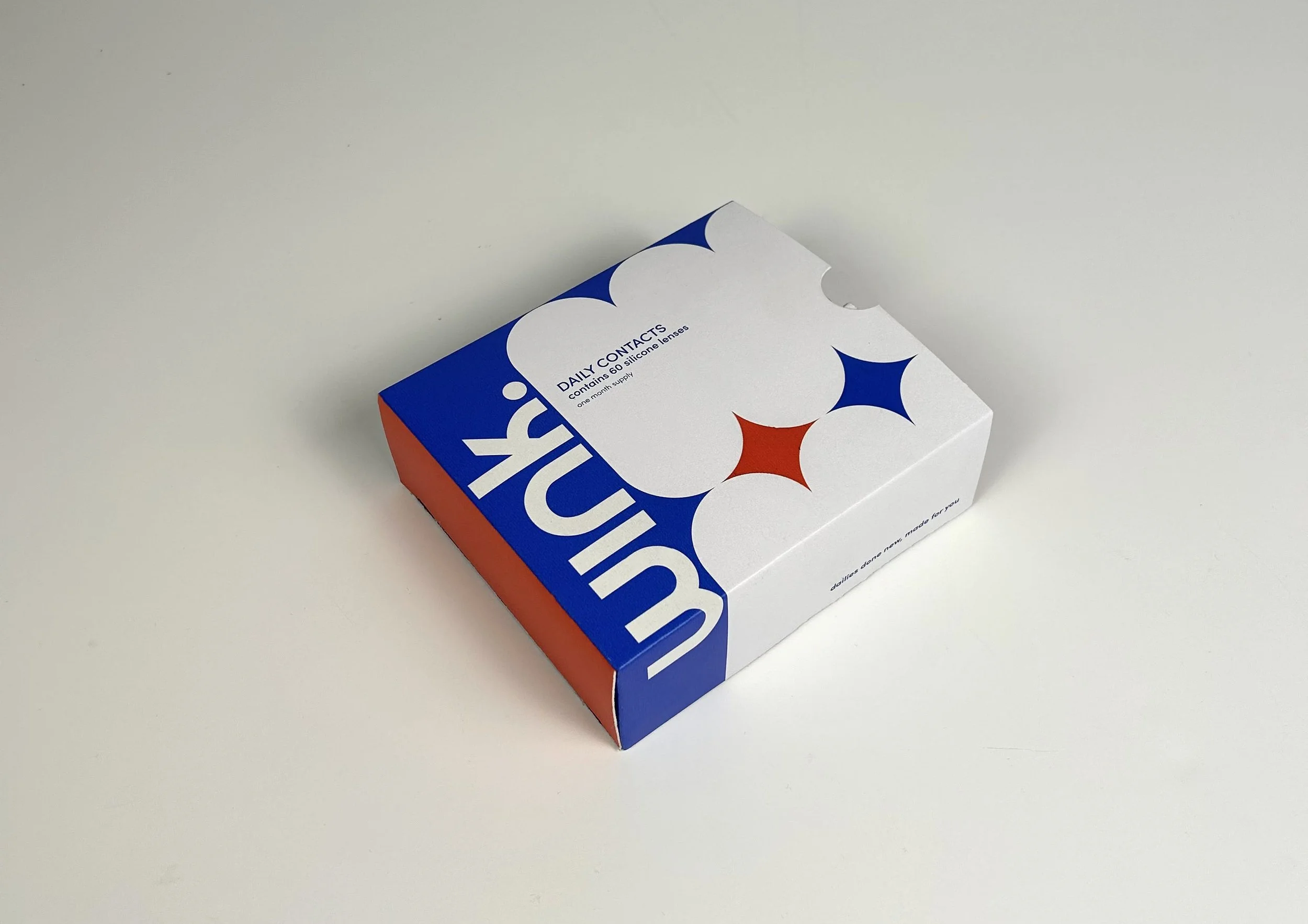
Taking our brand identity to the next level, refining our user and personality. Looking to present as playful, connected, and new in our visual appeal.
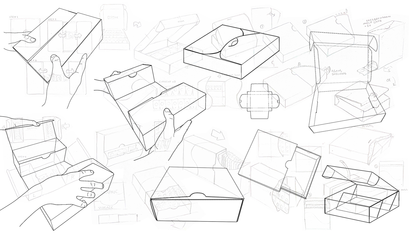
Refinement | Primary Pack
Continued Lens Prototyping & User Testing
Pack Exploratory
PHASE V | The Final Product
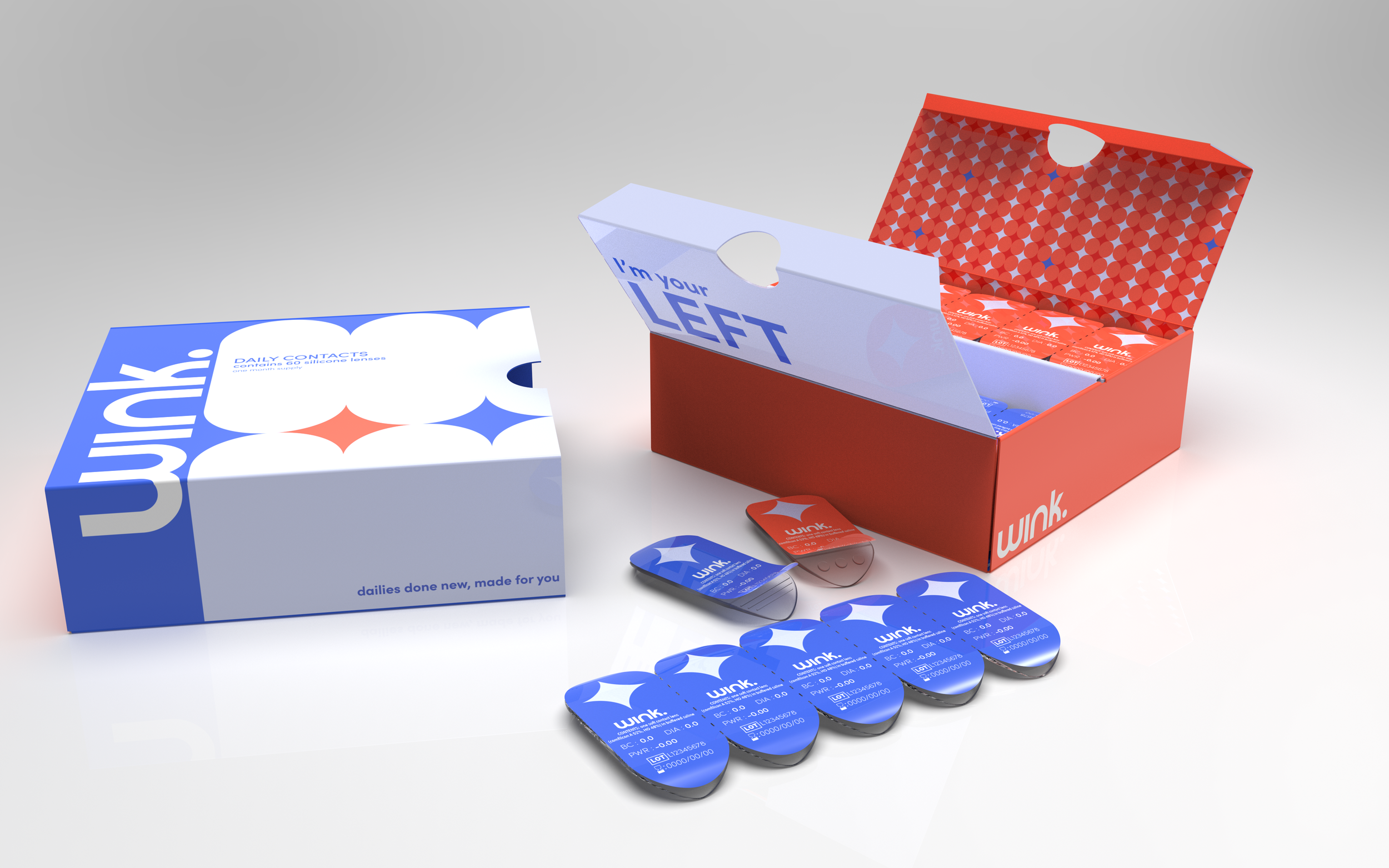
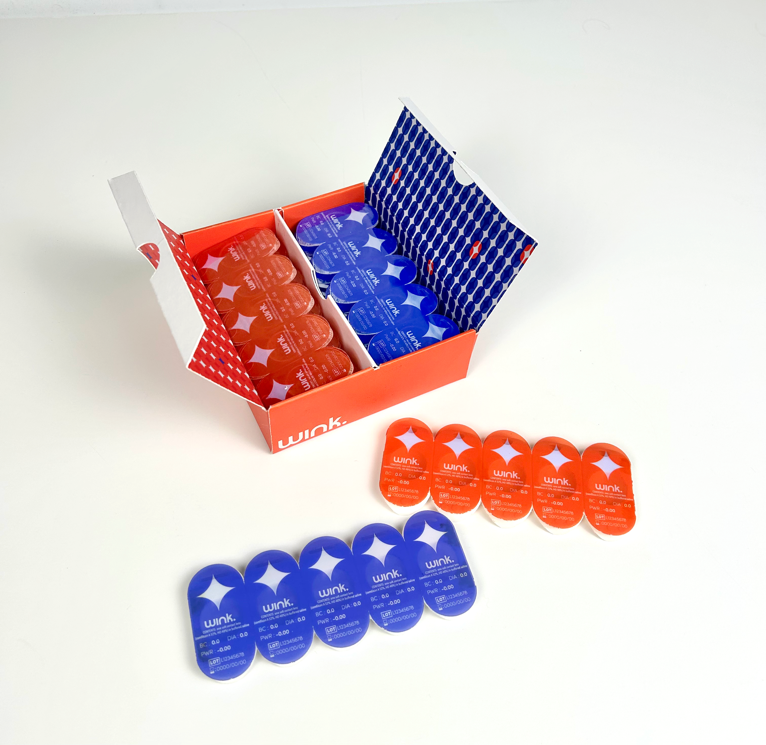
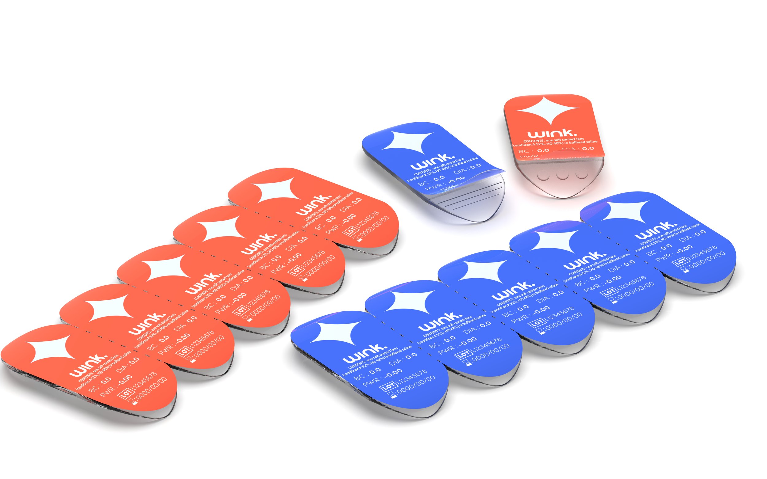
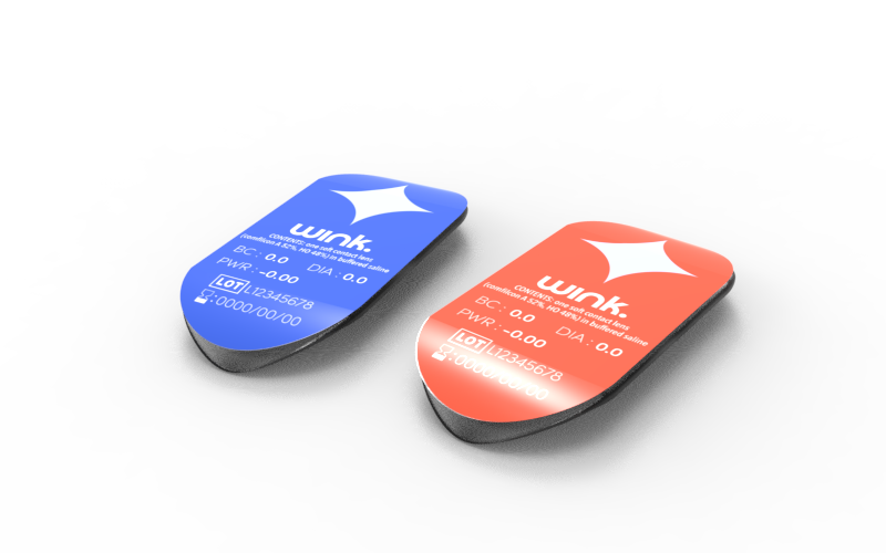
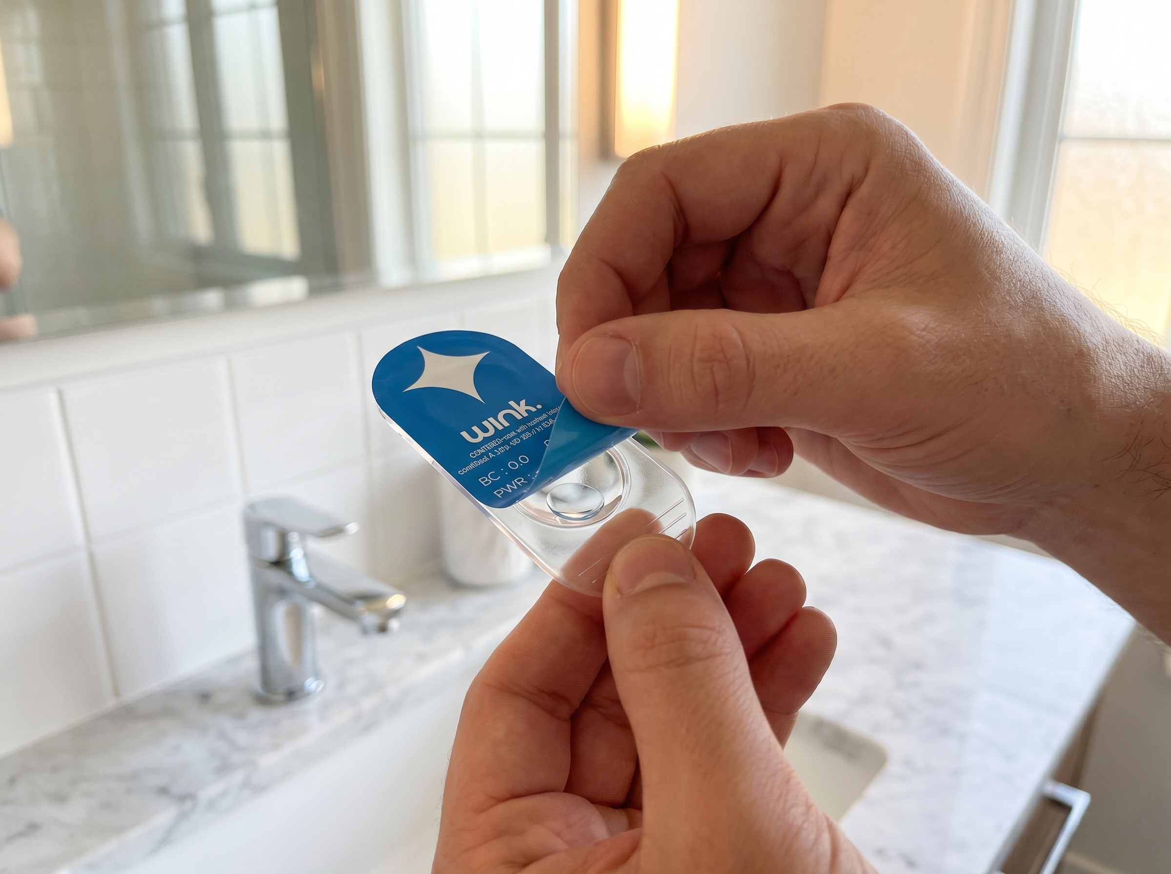
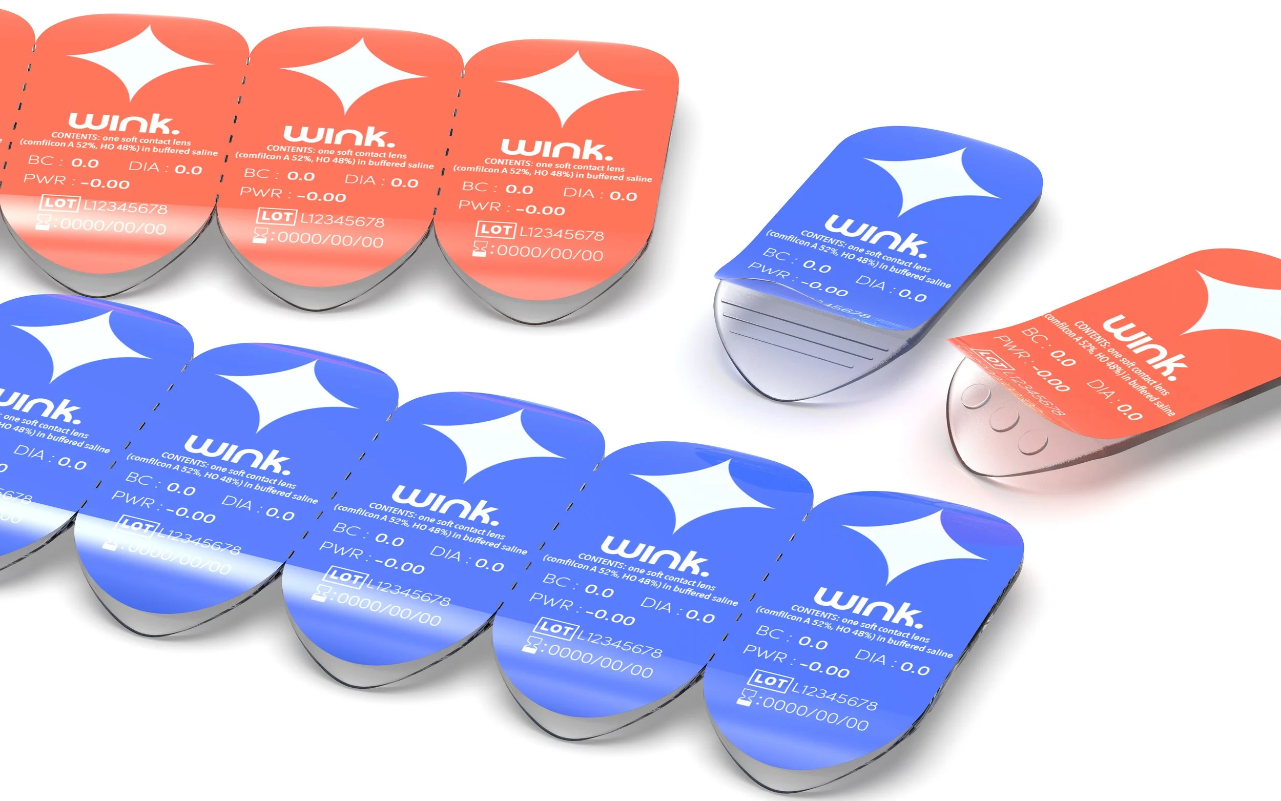
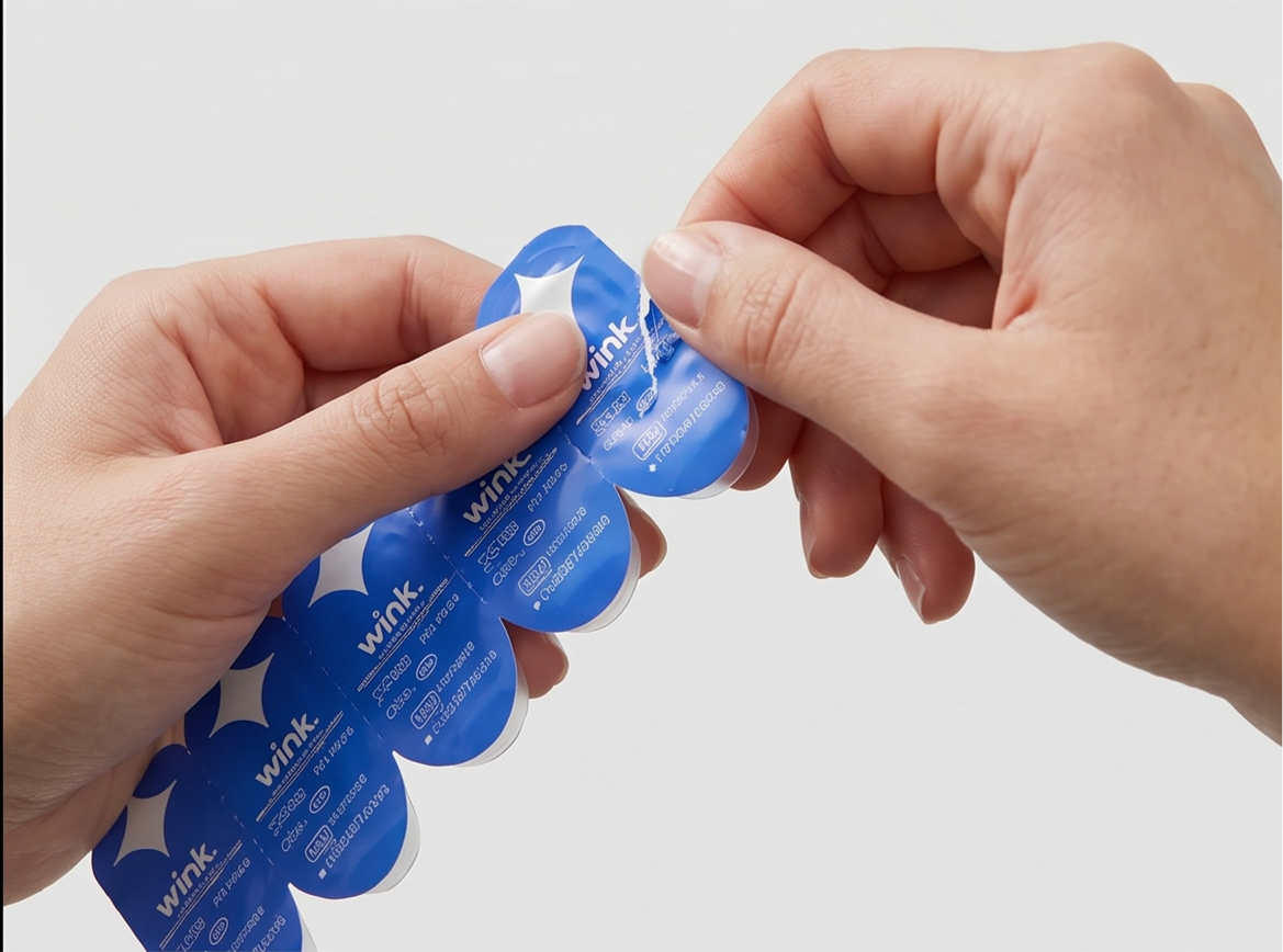
The Primary Blister Package.
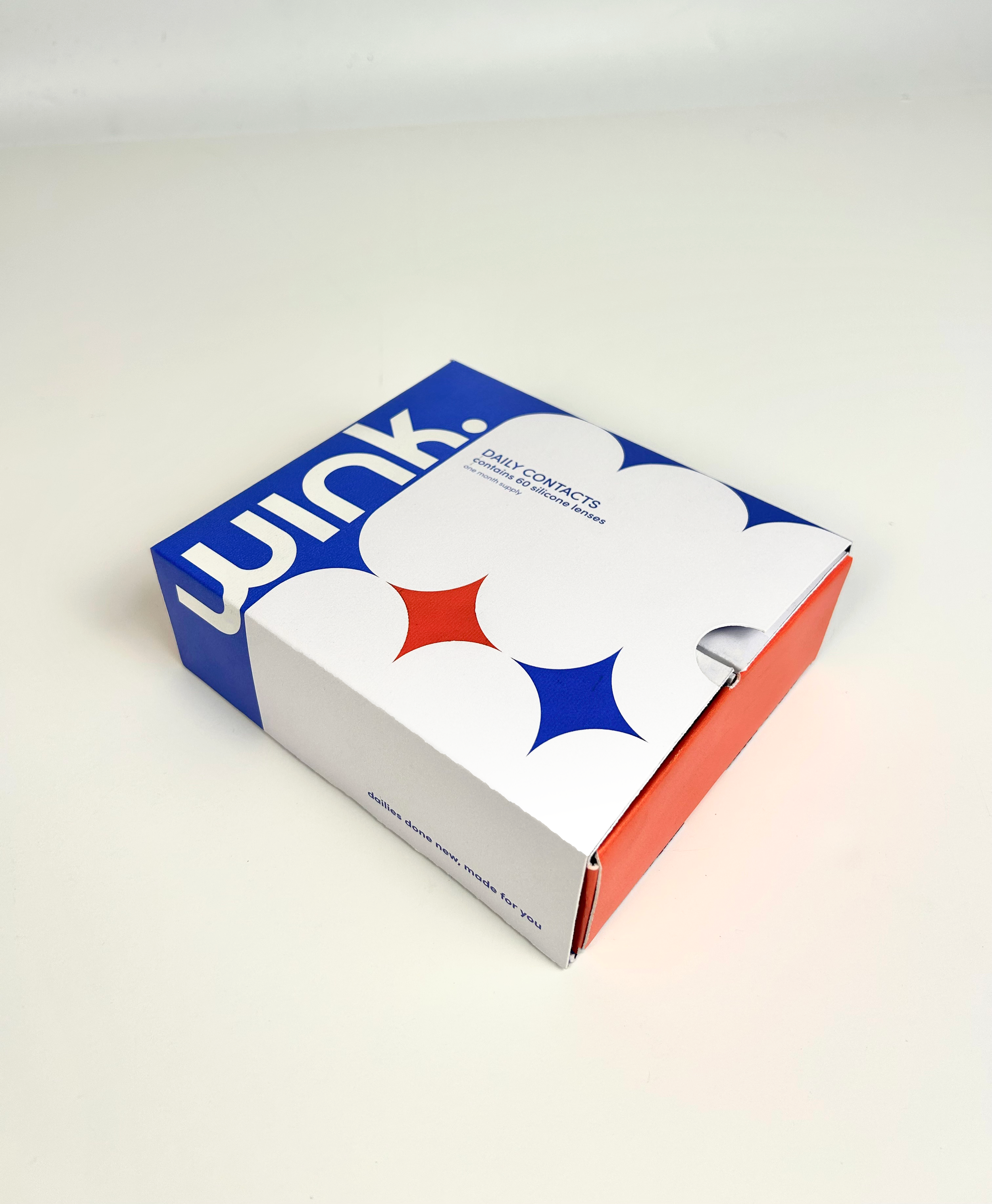
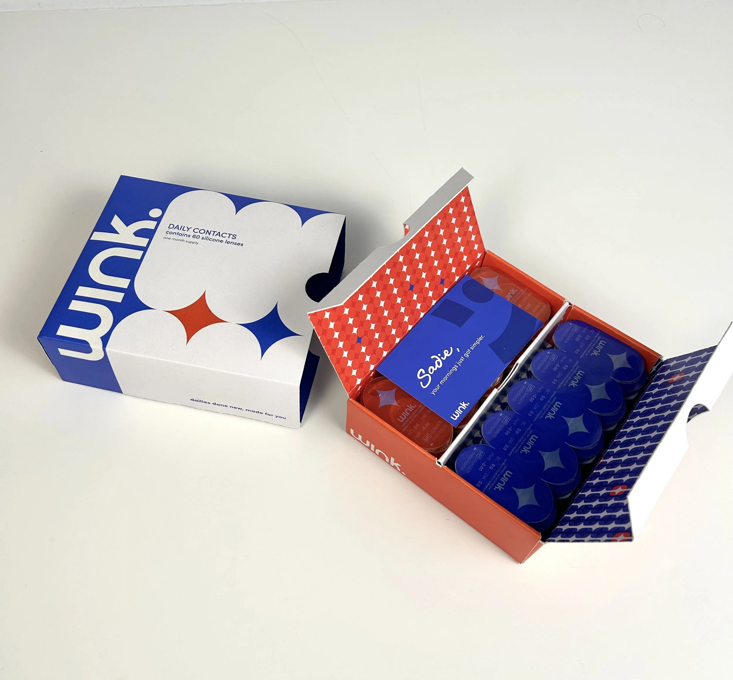
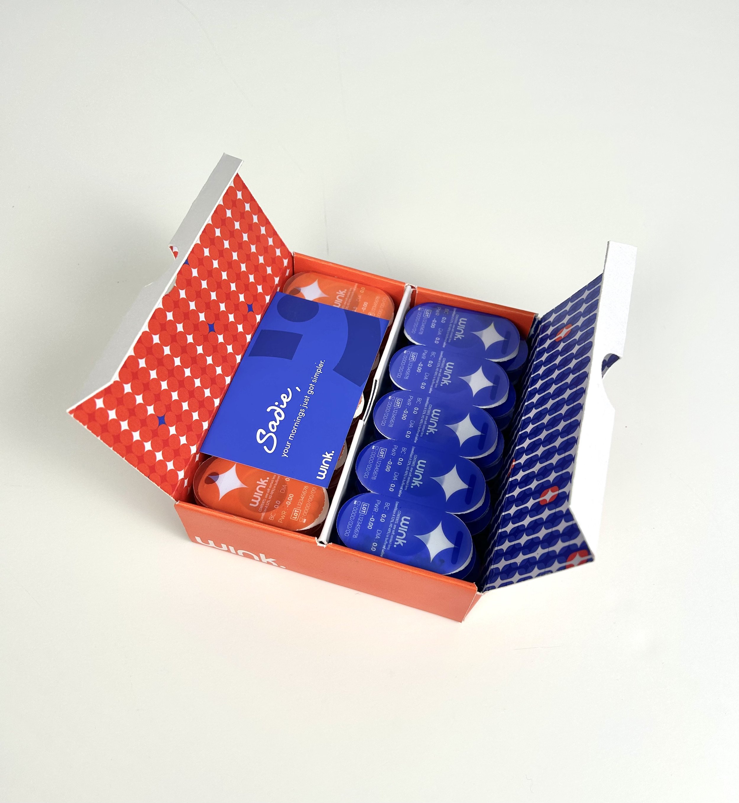
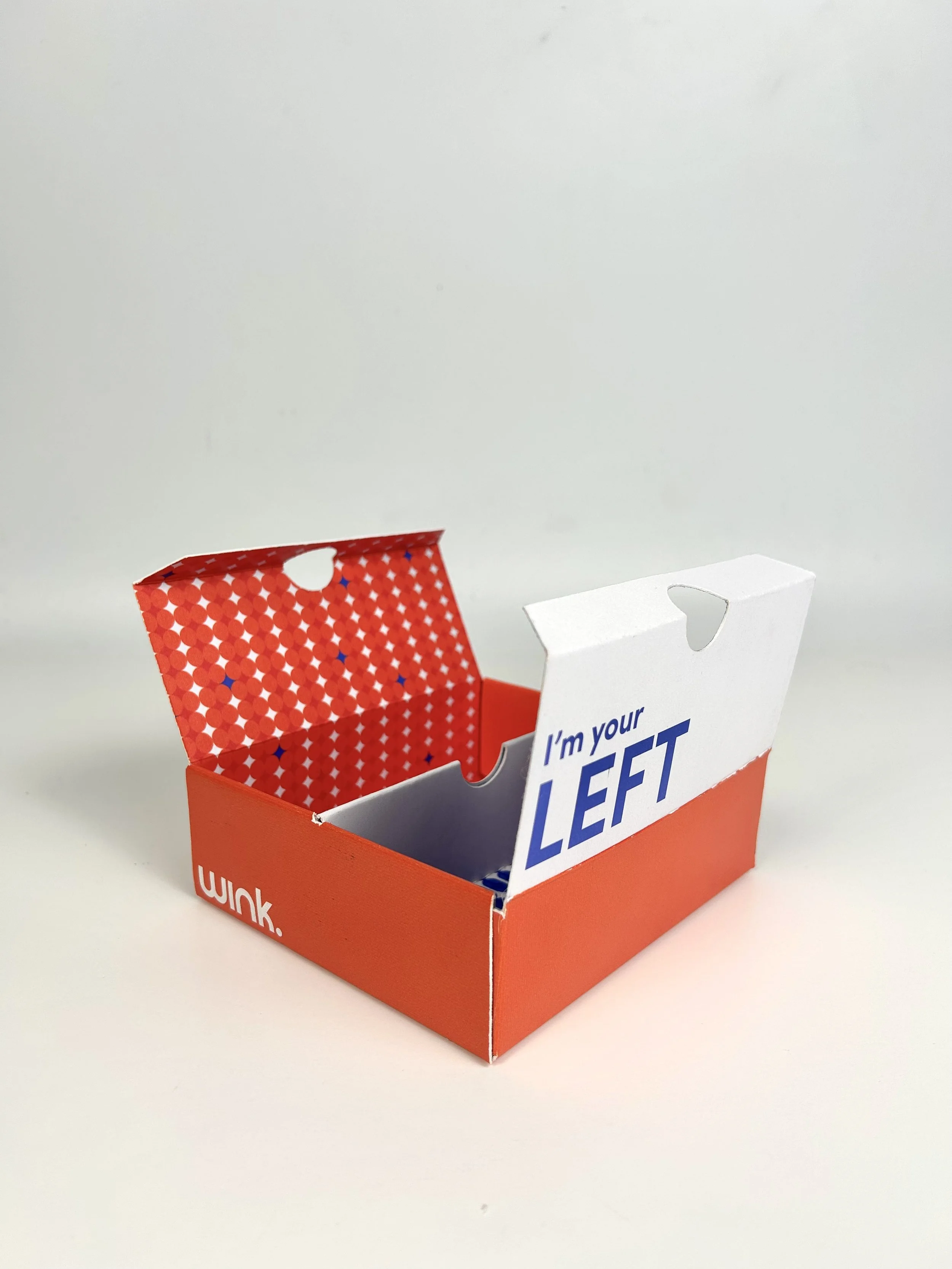
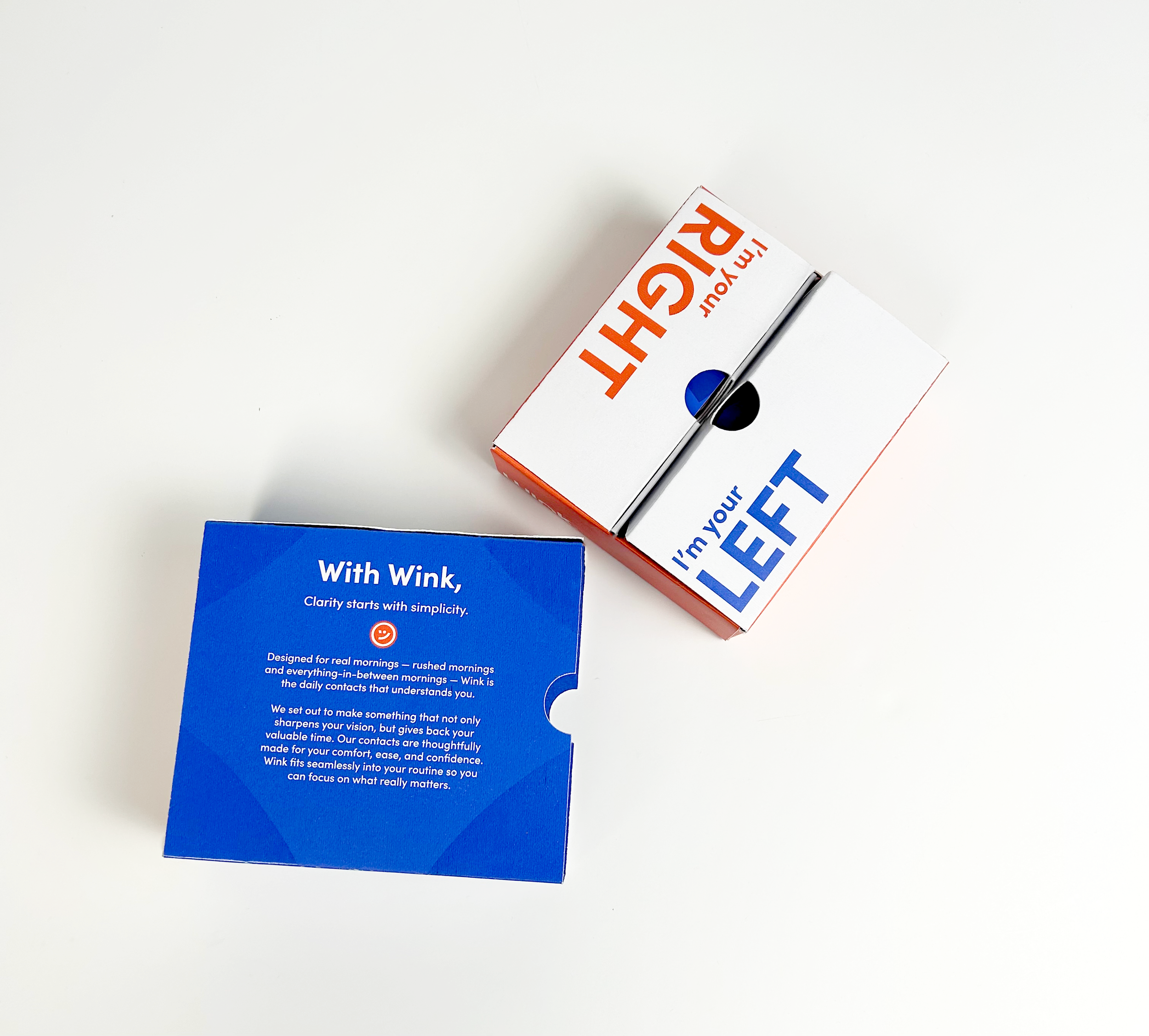
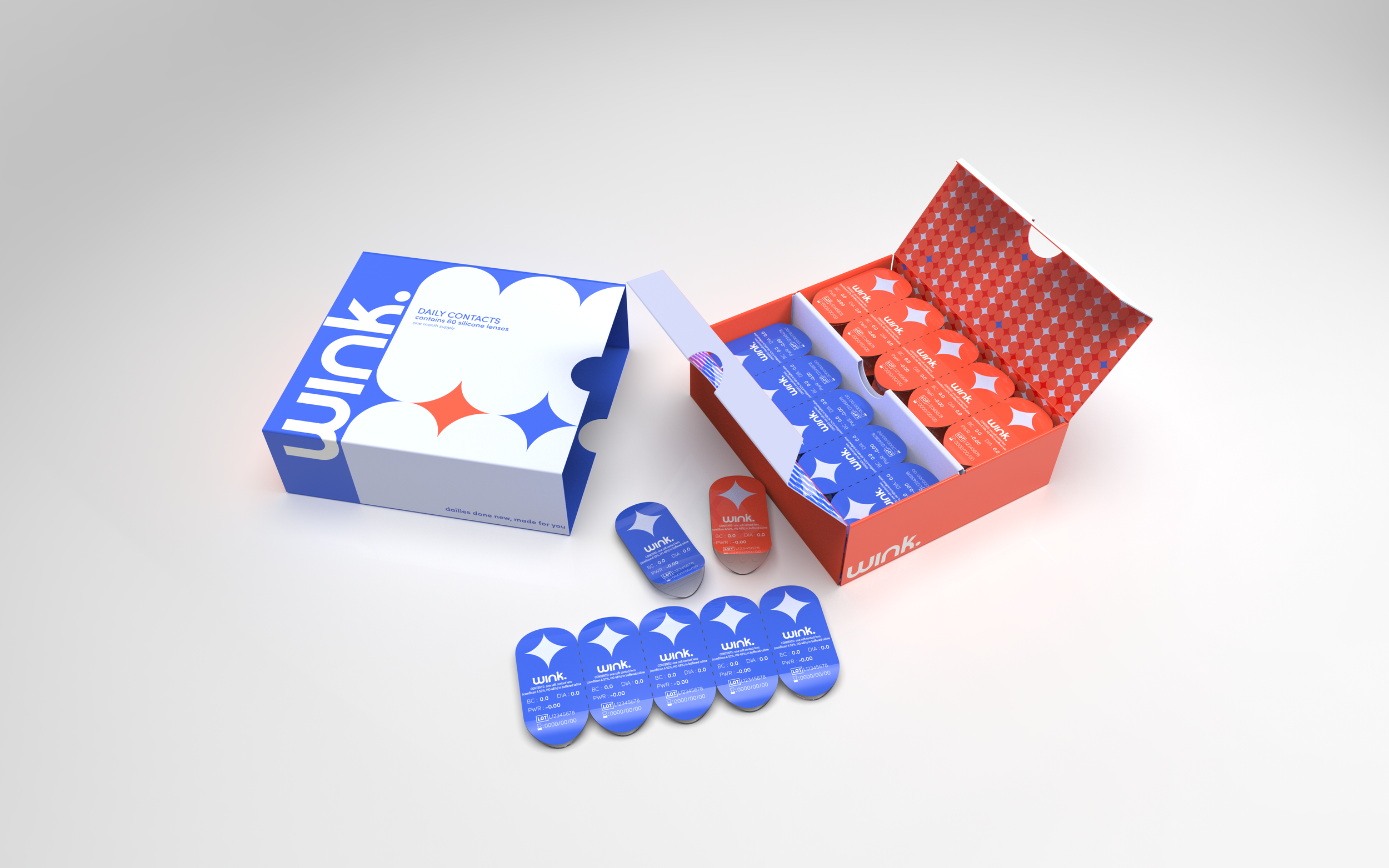
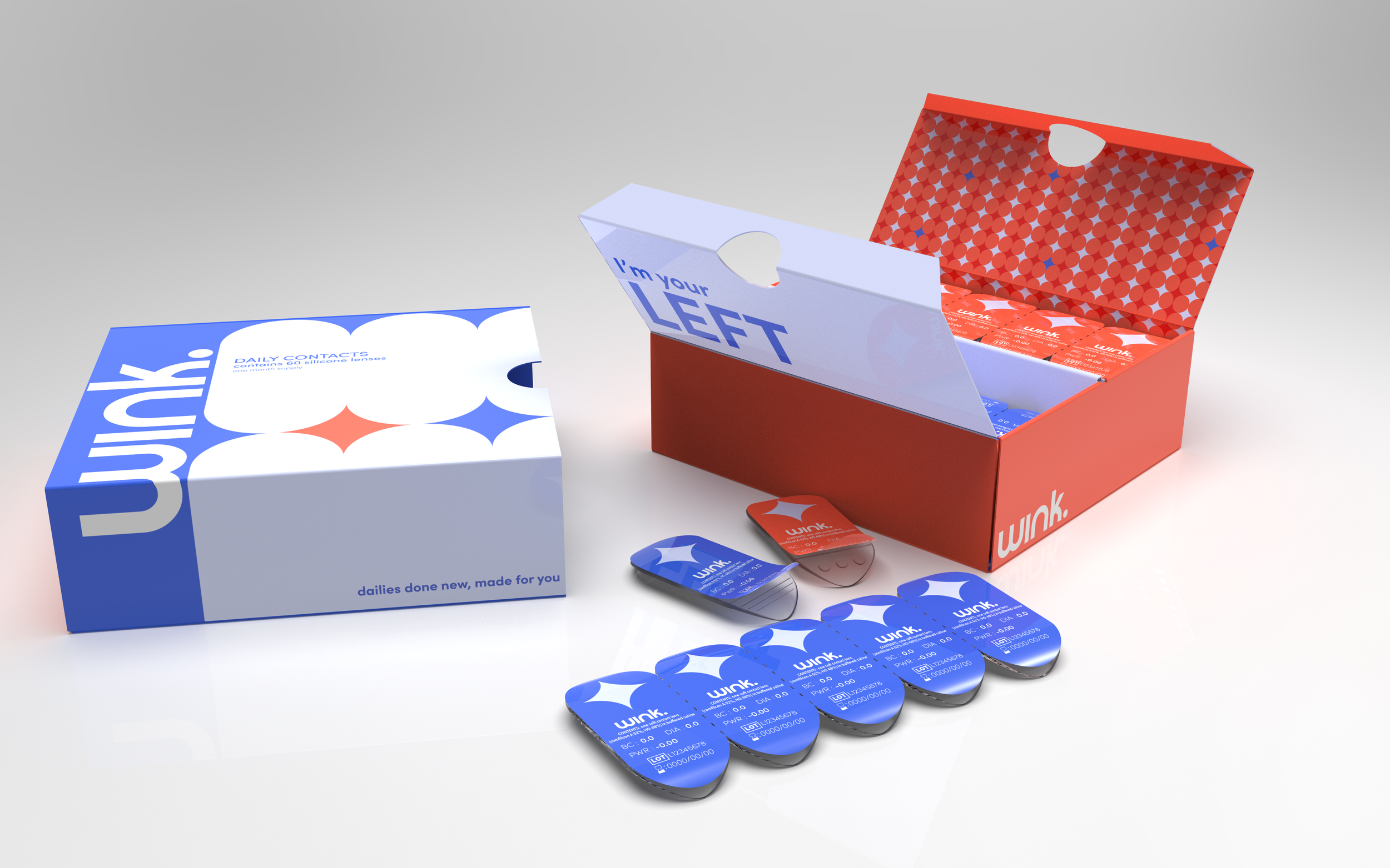
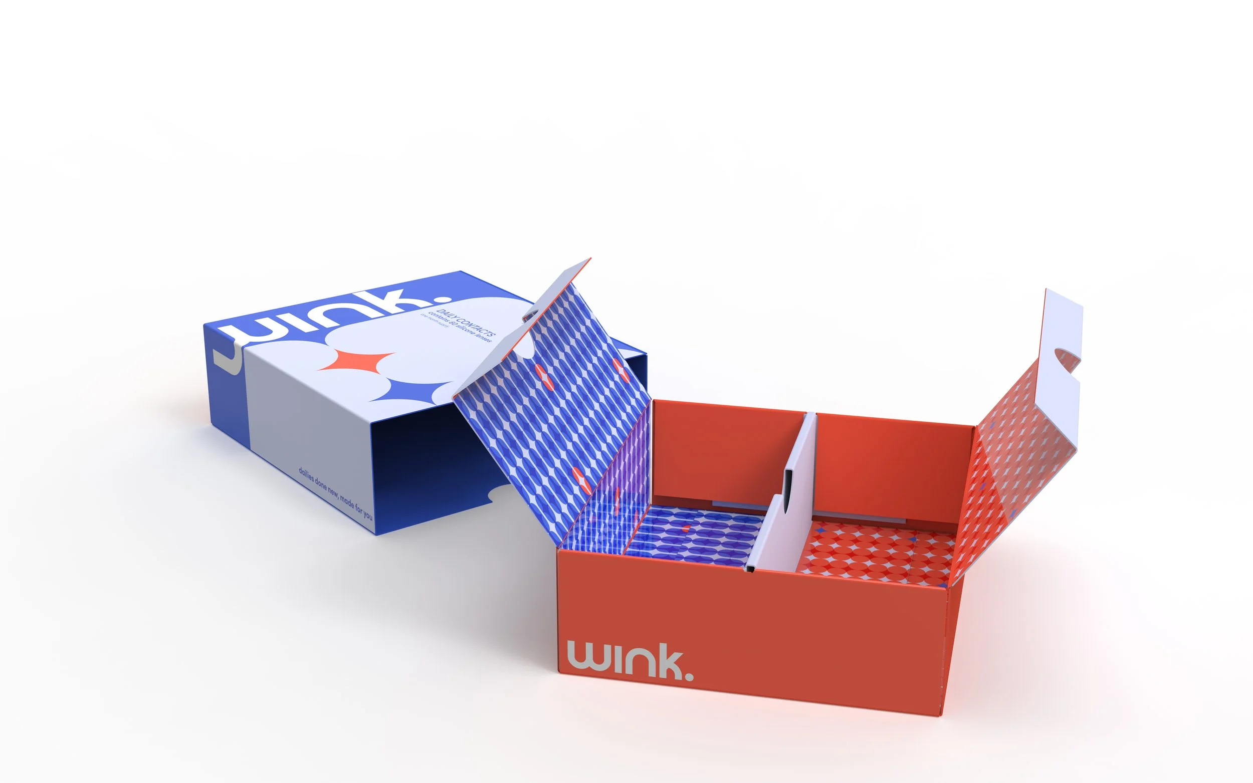
The Secondary Blister Package.
The Final Dyelines.
Deep diving into the final graphics and why we went in this direction.
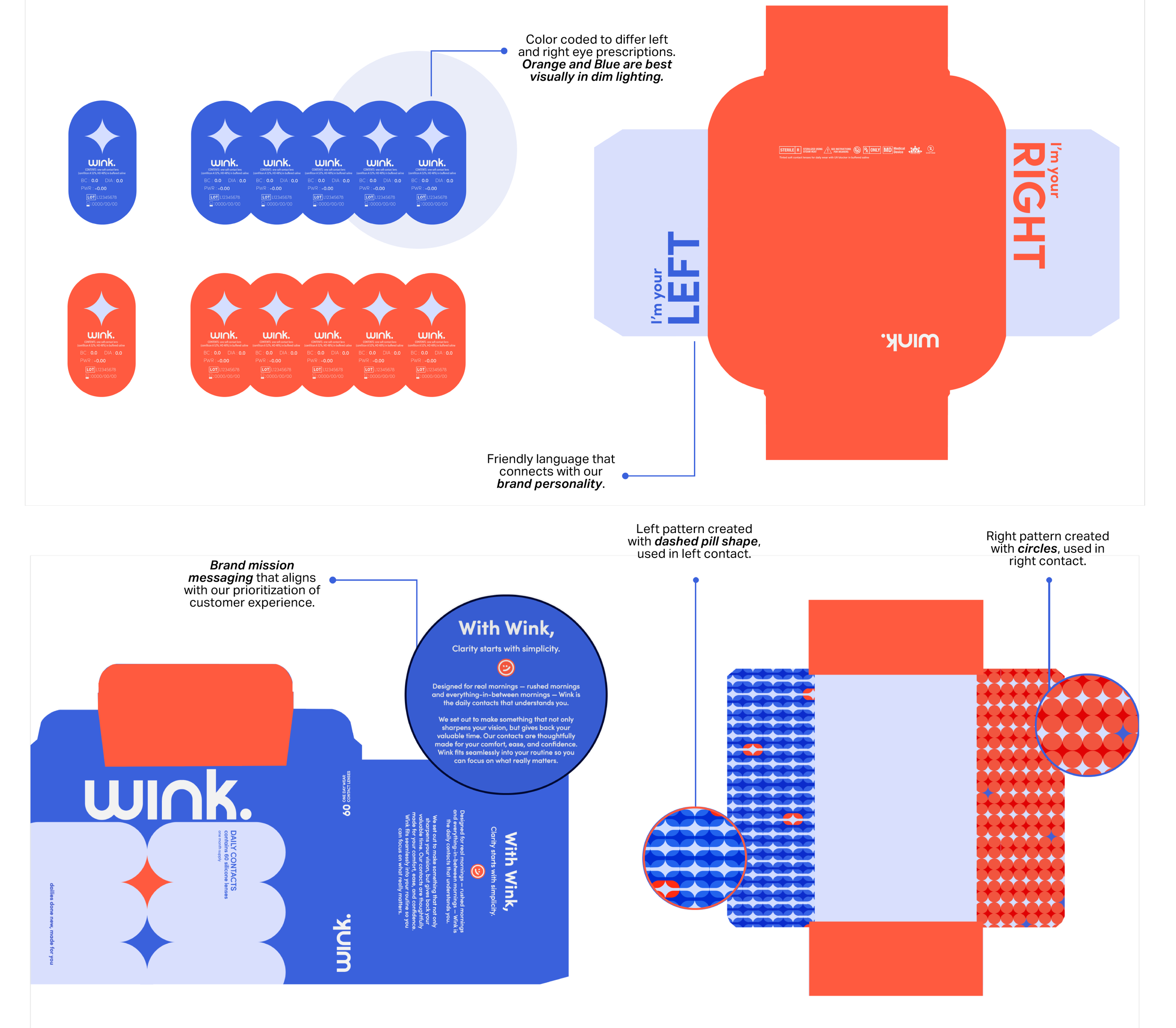
The Final Dyelines.
The Final Dyelines.
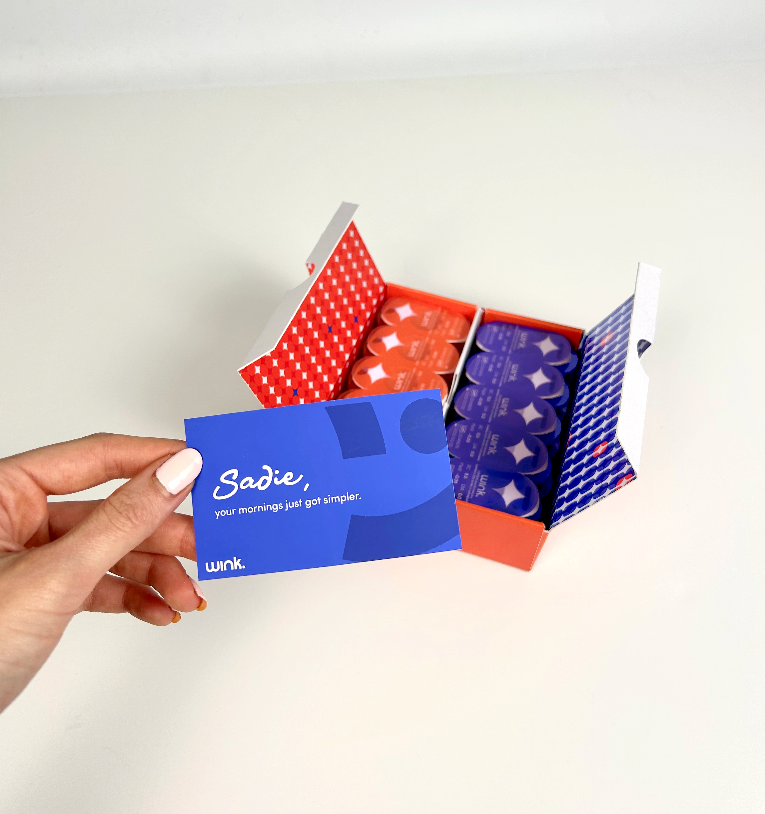
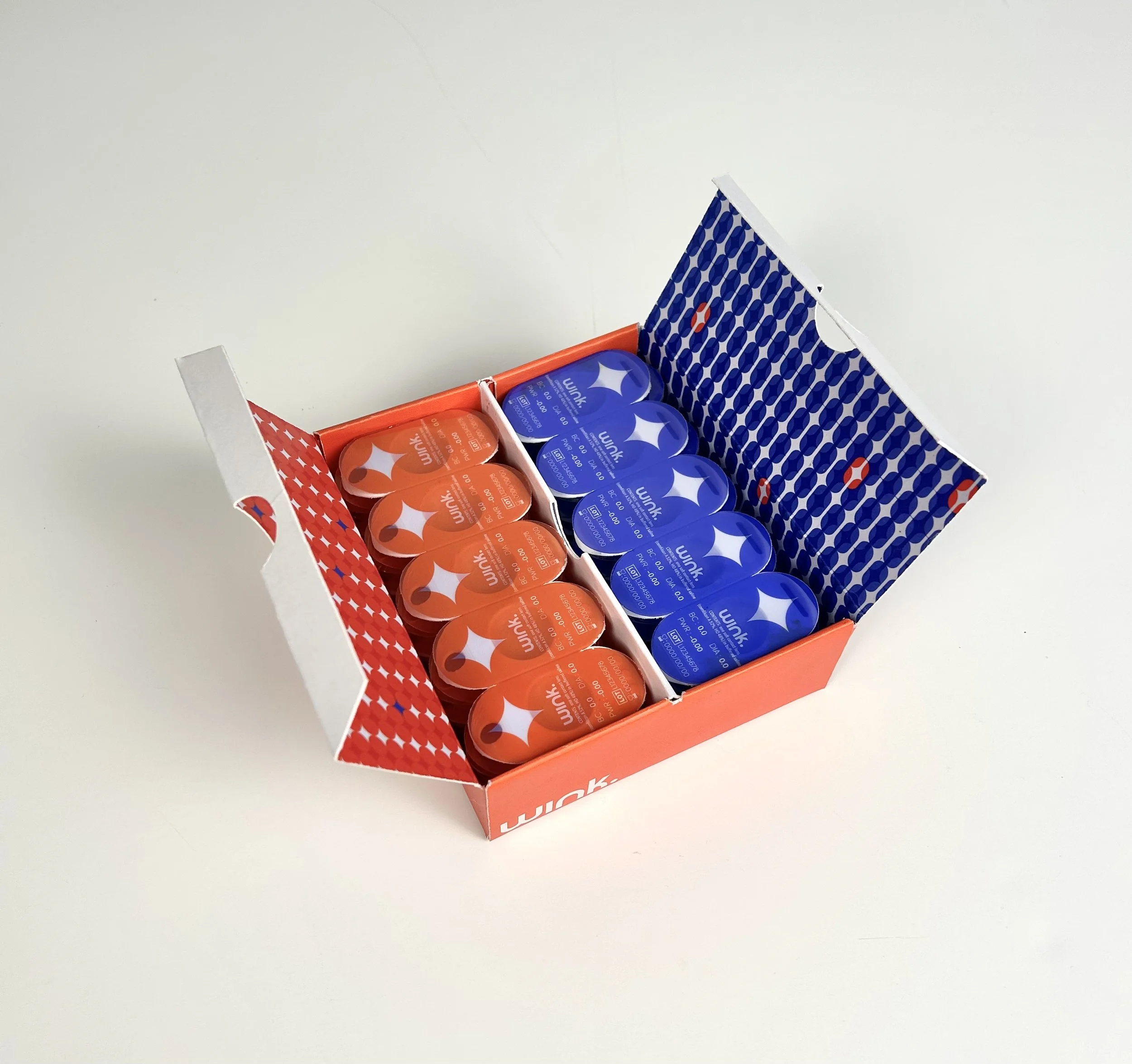
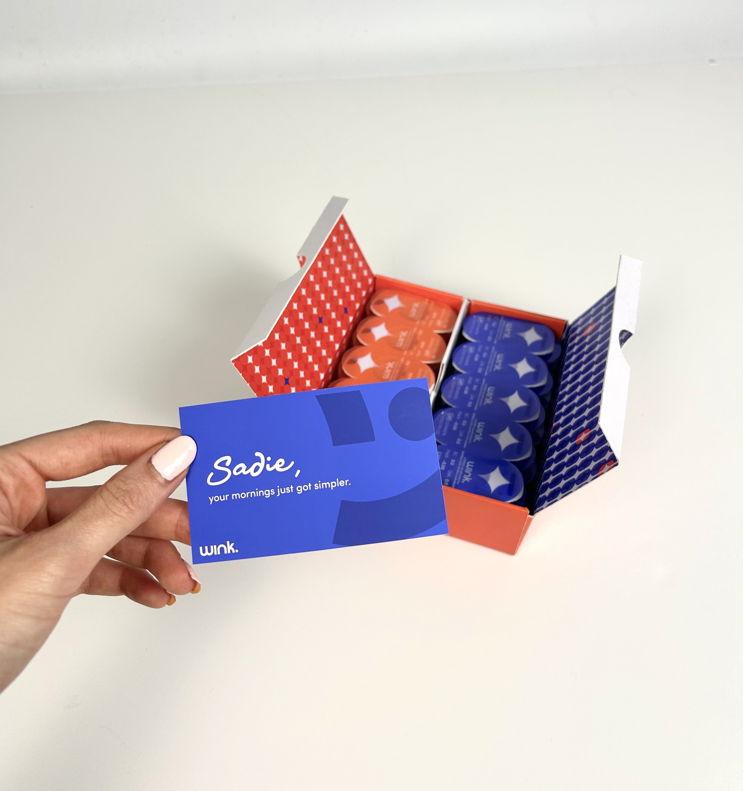
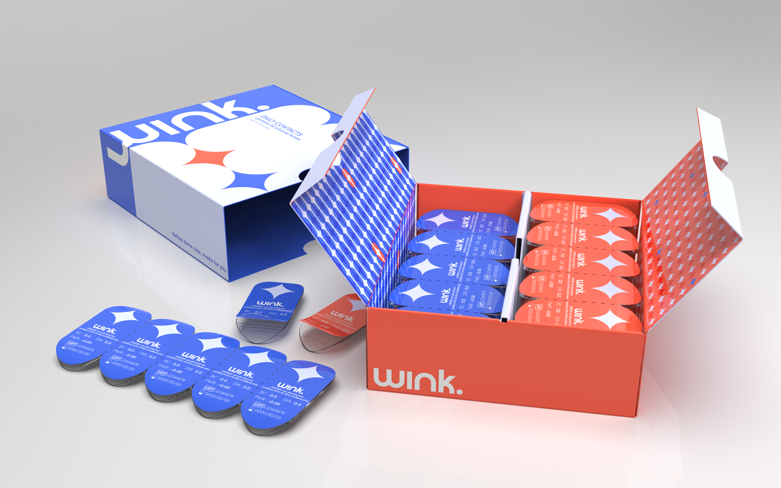
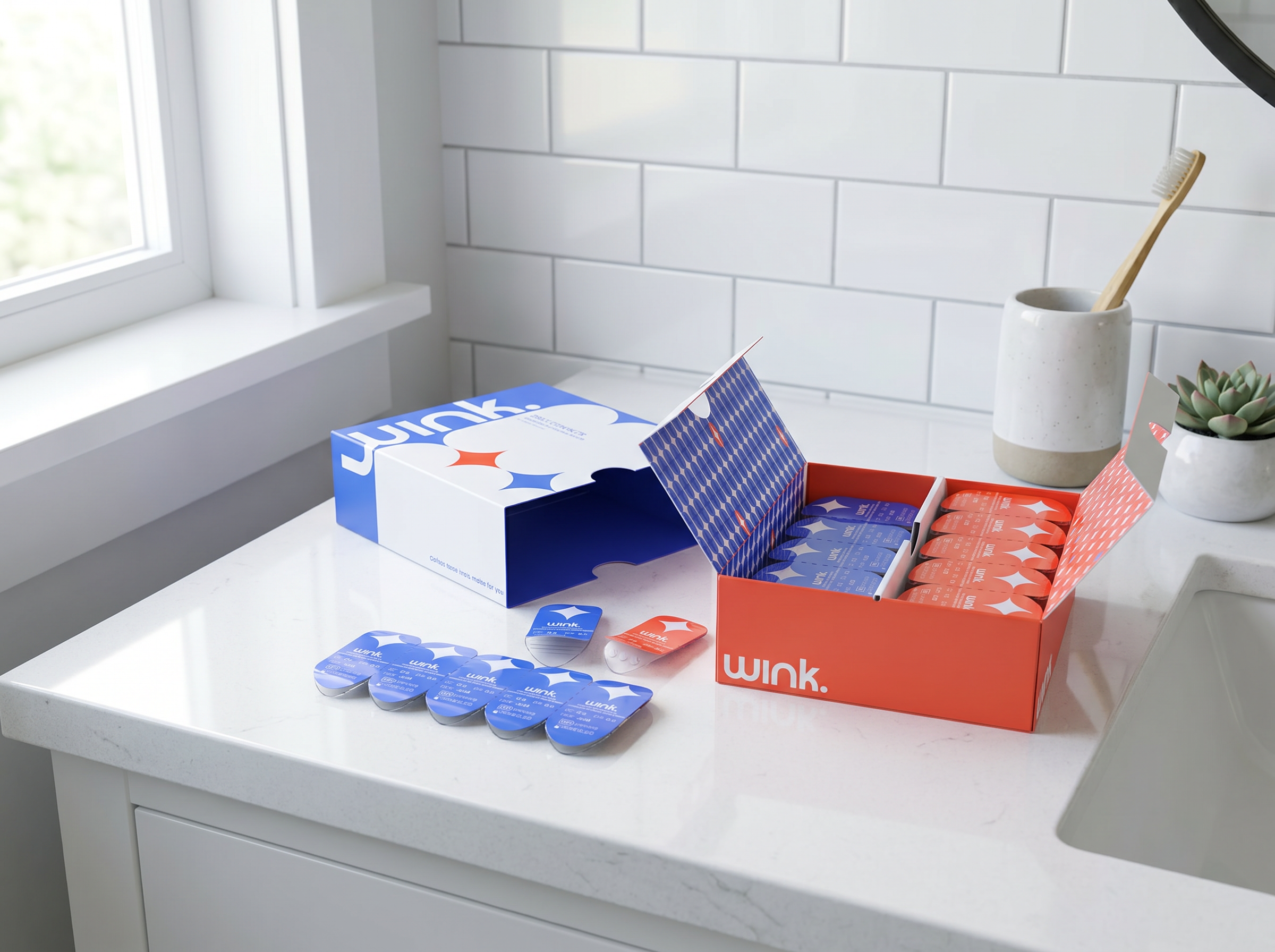
And what you’ll find inside.
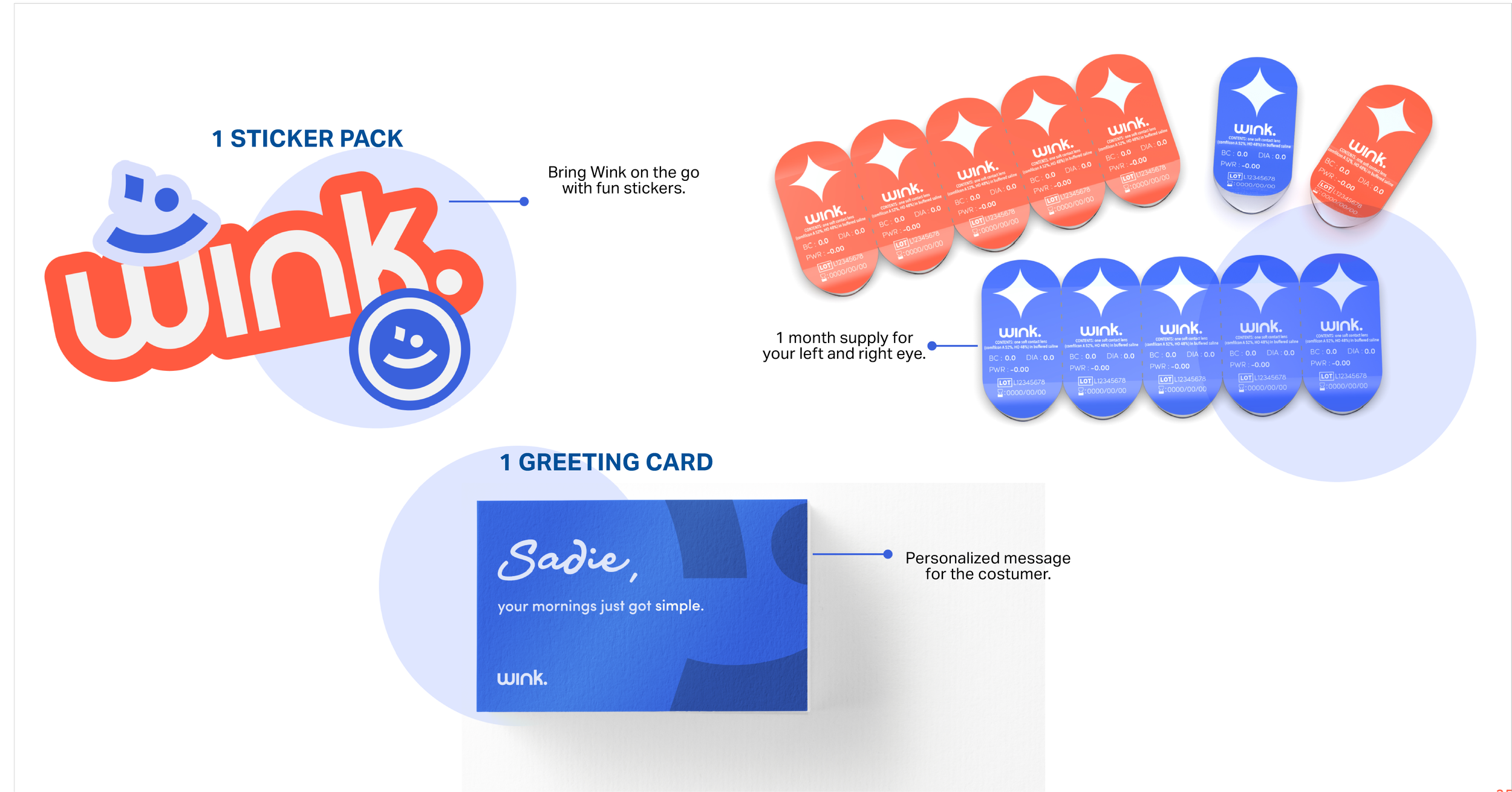
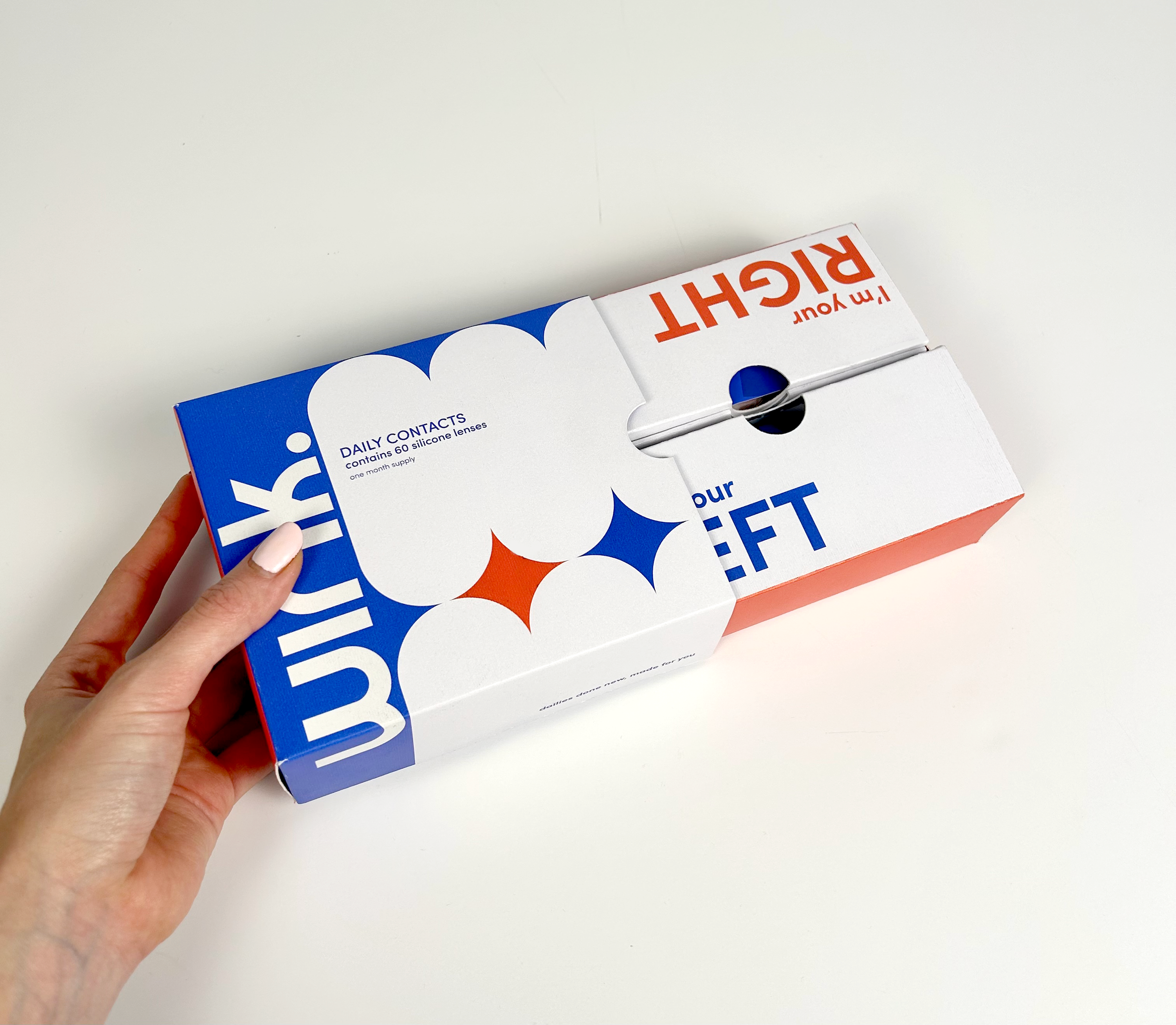
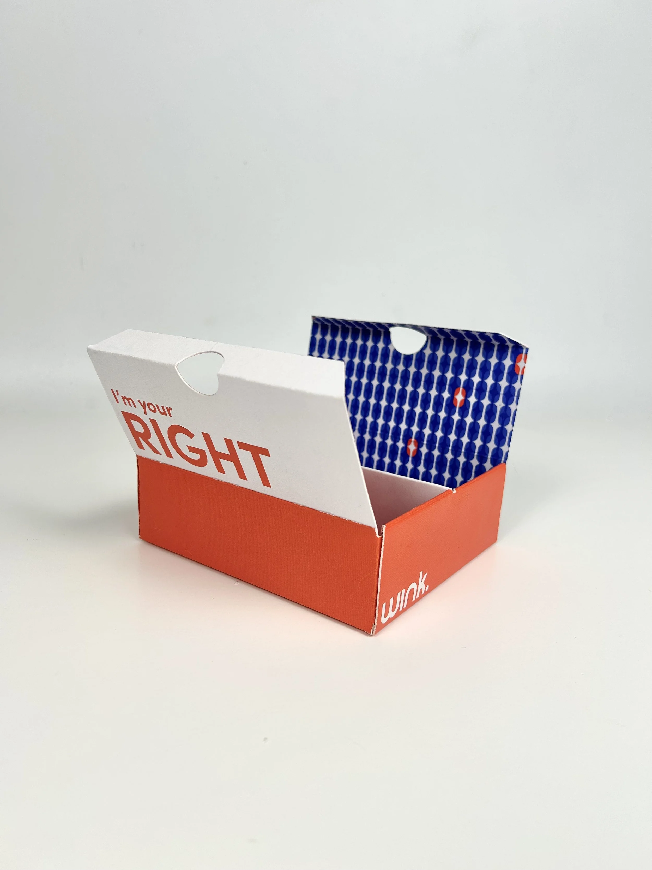
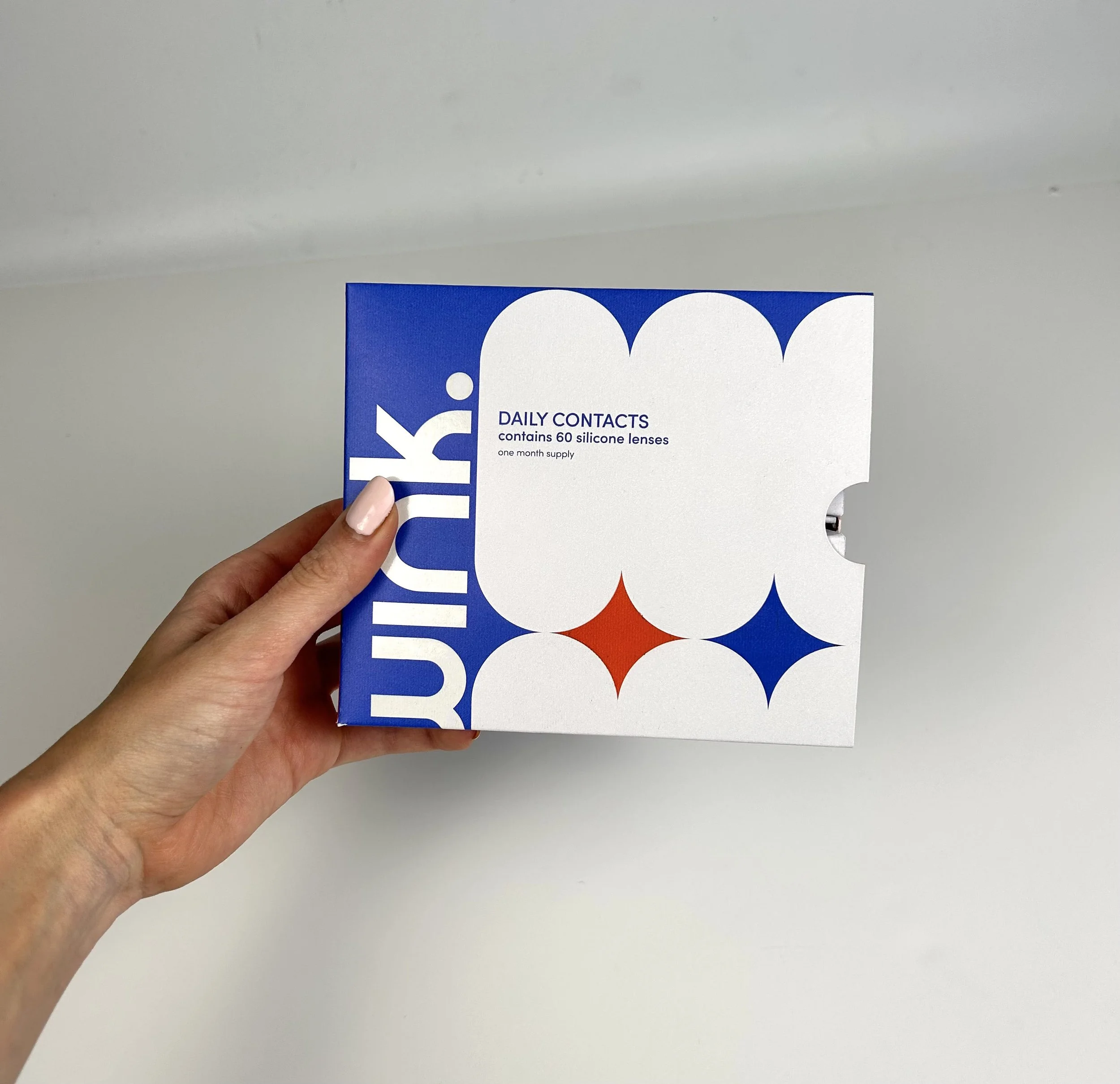
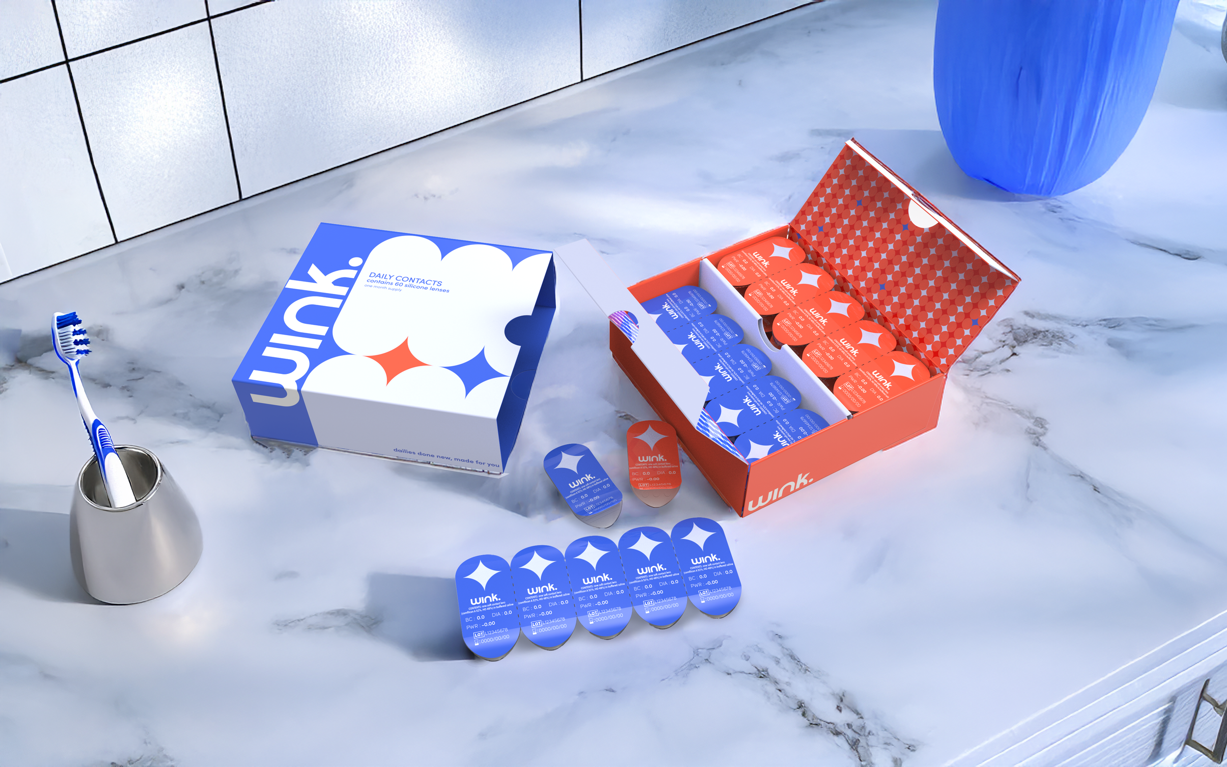
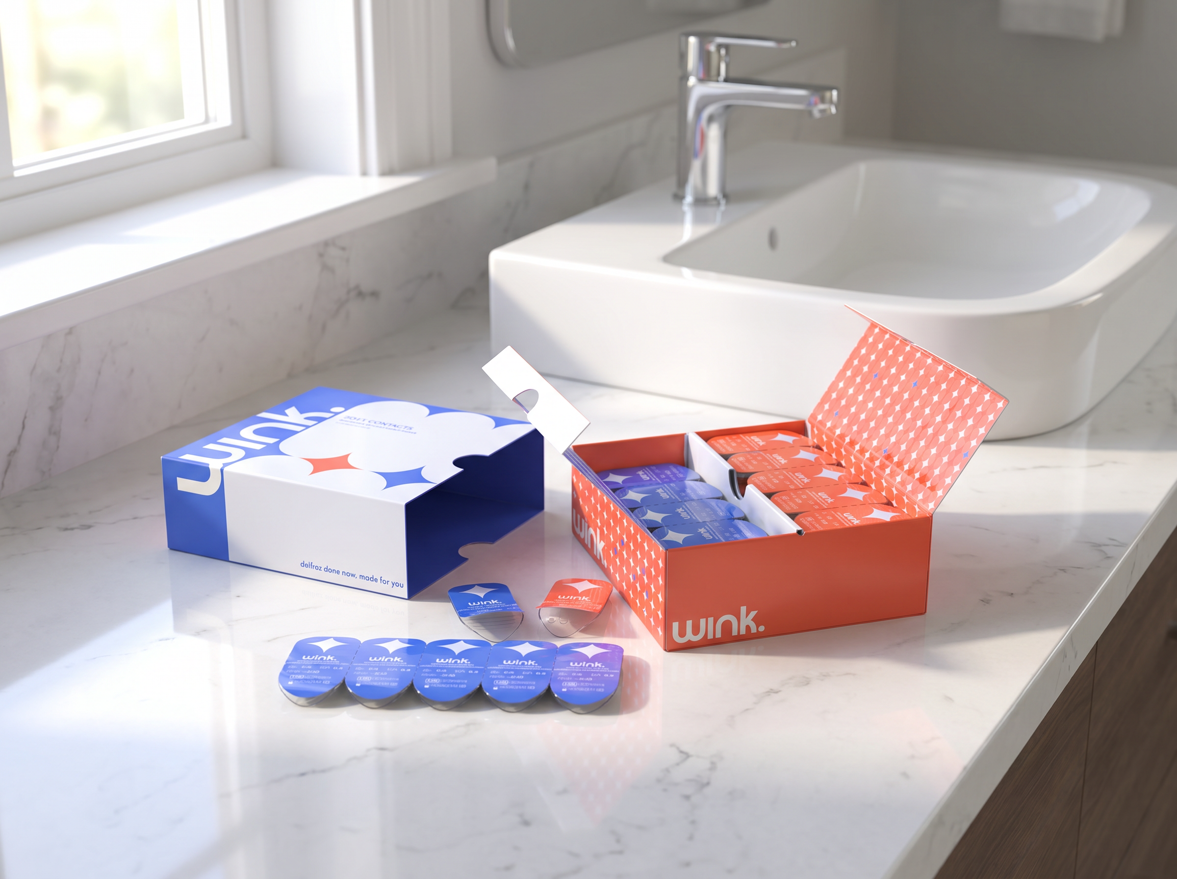
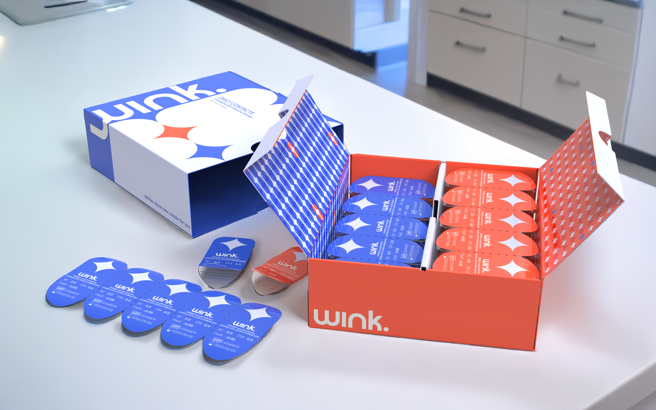
The Final Prototype:
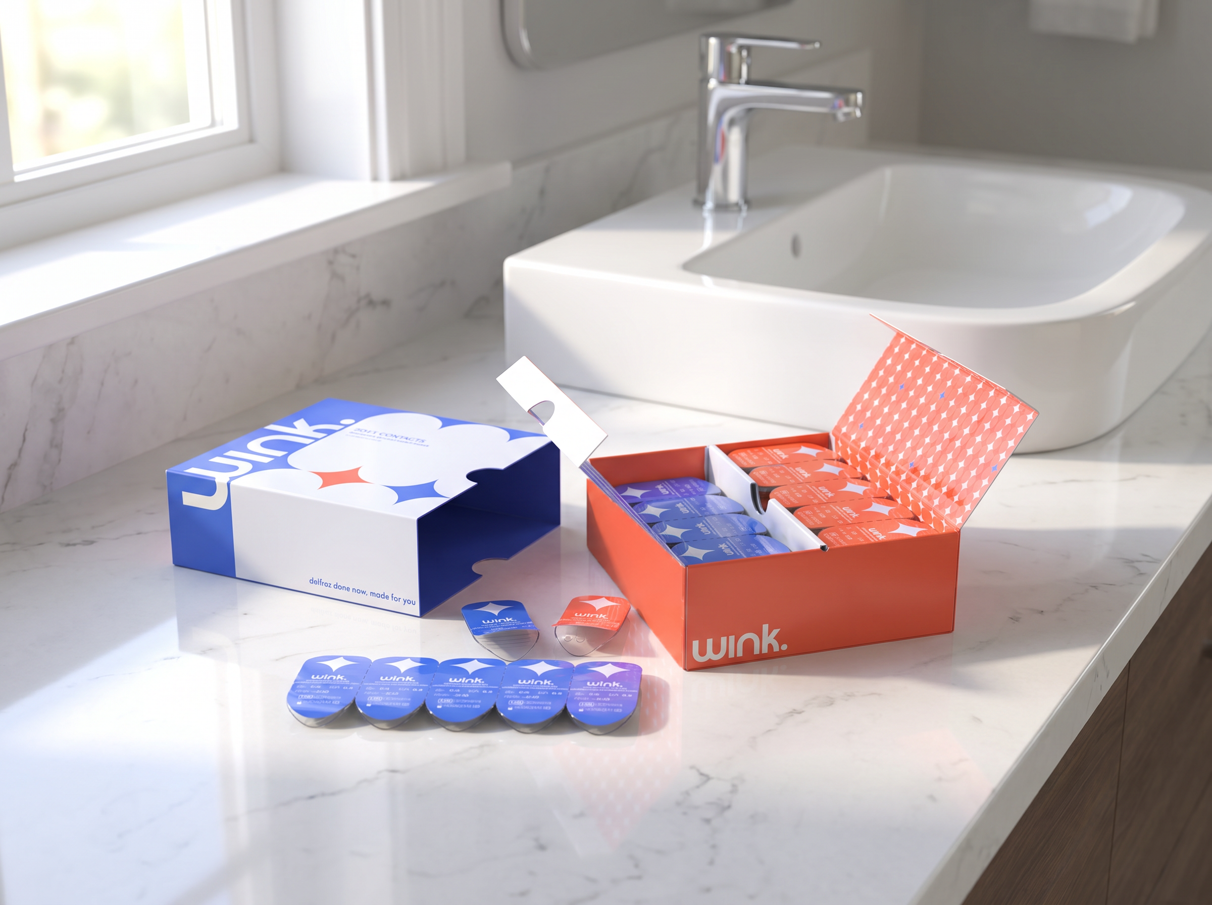
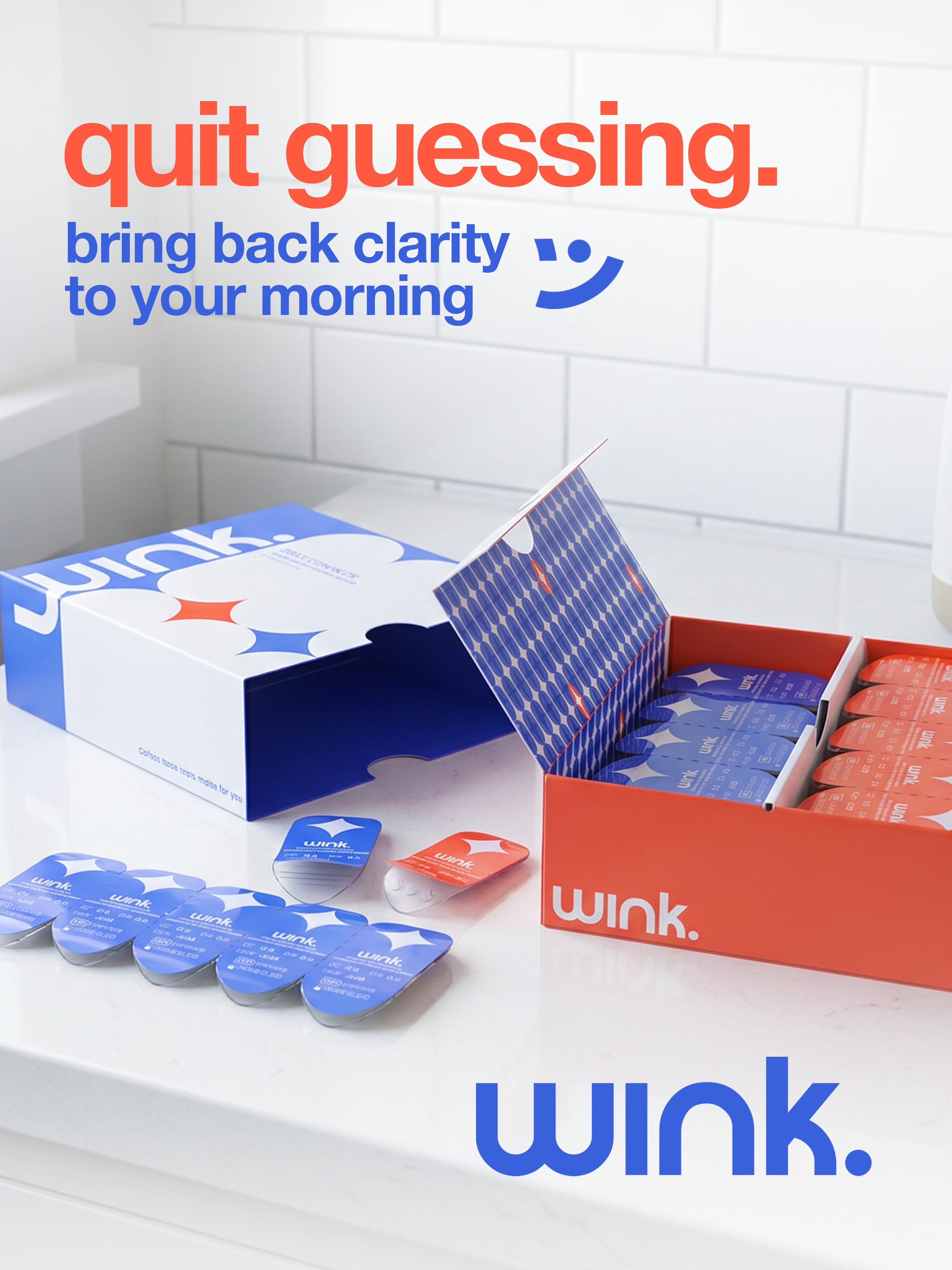
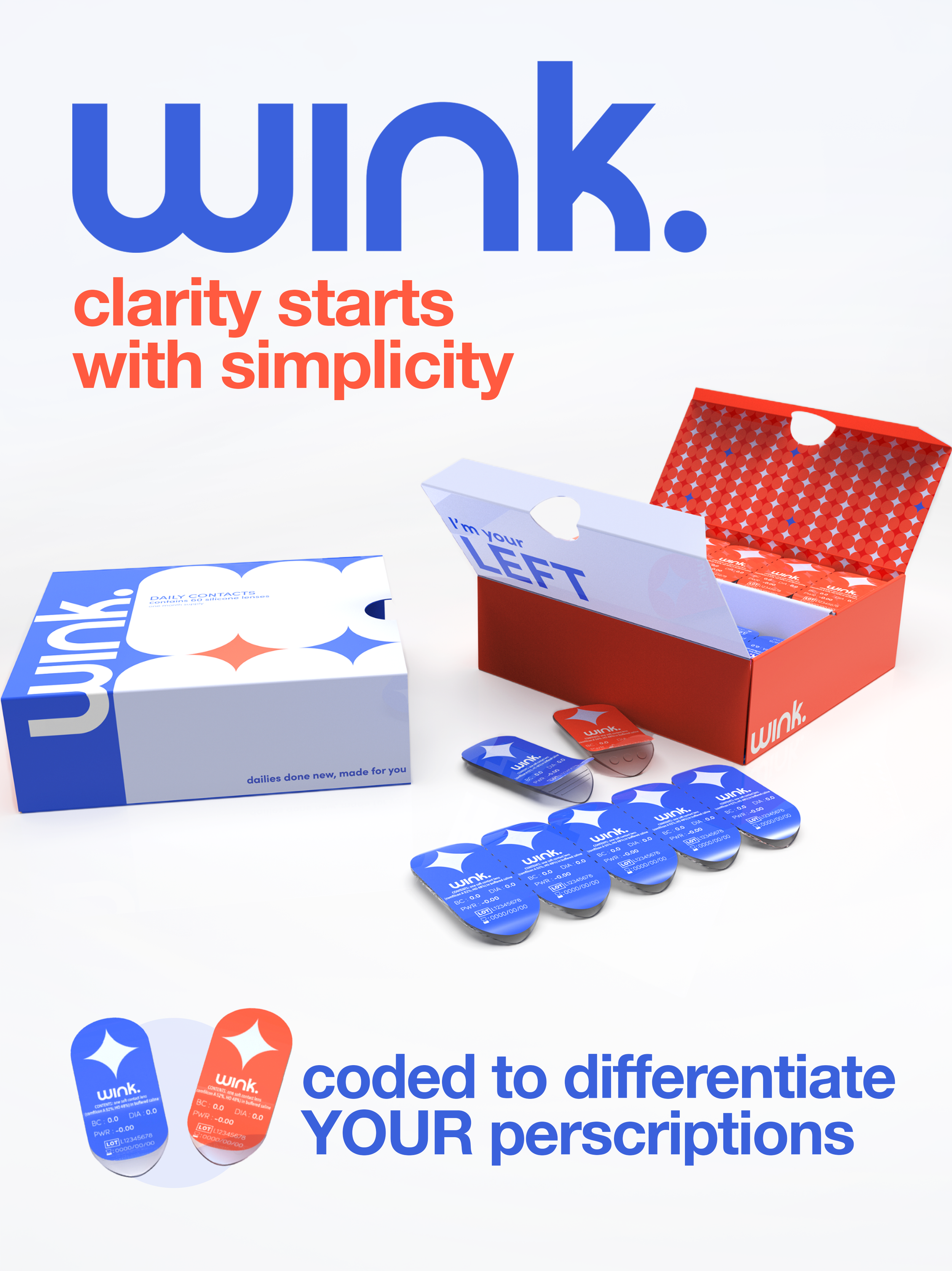
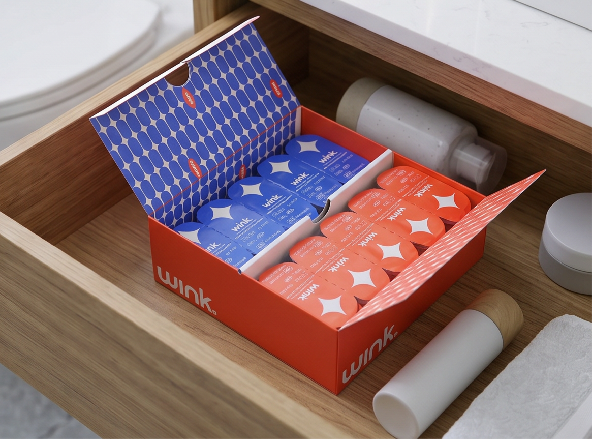
The Final Renders:
Meet the Wink Team!

Lauren Nessif
Graphic Design

Margot Chamberlin
Graphic Design
Samara Bill
Graphic Design

Caroline Schwartz (me)
Industrial Design